Transaction Enrichment - Nomo Bank App
Improve users experience by visually improving the Transactions area of the App
My Role: UI Design | Tools: Figma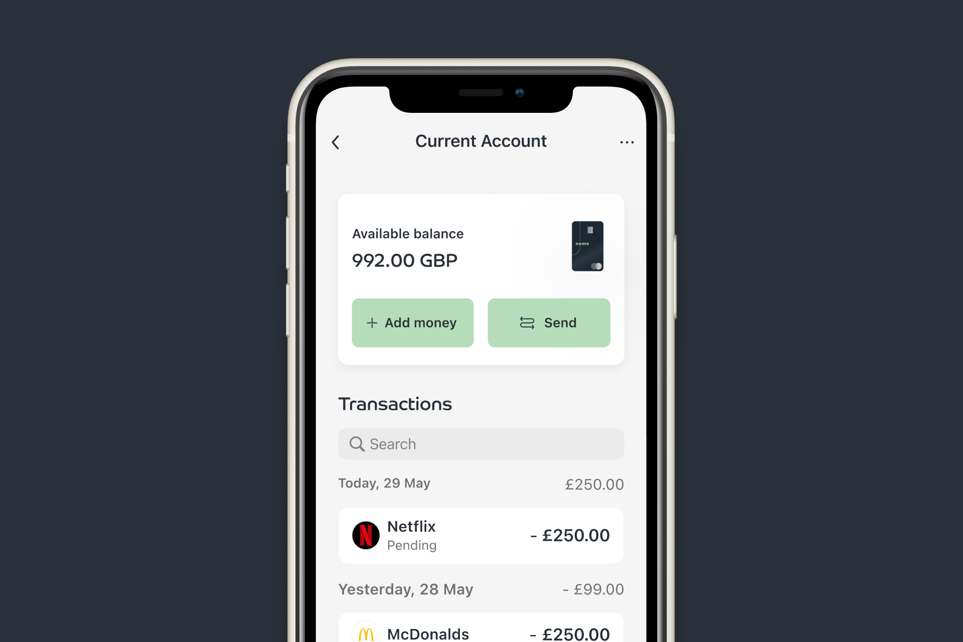
Challenge
Currently when users go to the transactions page to see their transactions, there is only minimal information provided for them to understand their transactions. It can be hard for users to recognise their transactions when scrolling through a lot of transactions.
To improve the customer experience, we would need to improve the transaction area to help customers have more context behind their transactions, and to make necessary updates to the the visual experience.
Solution
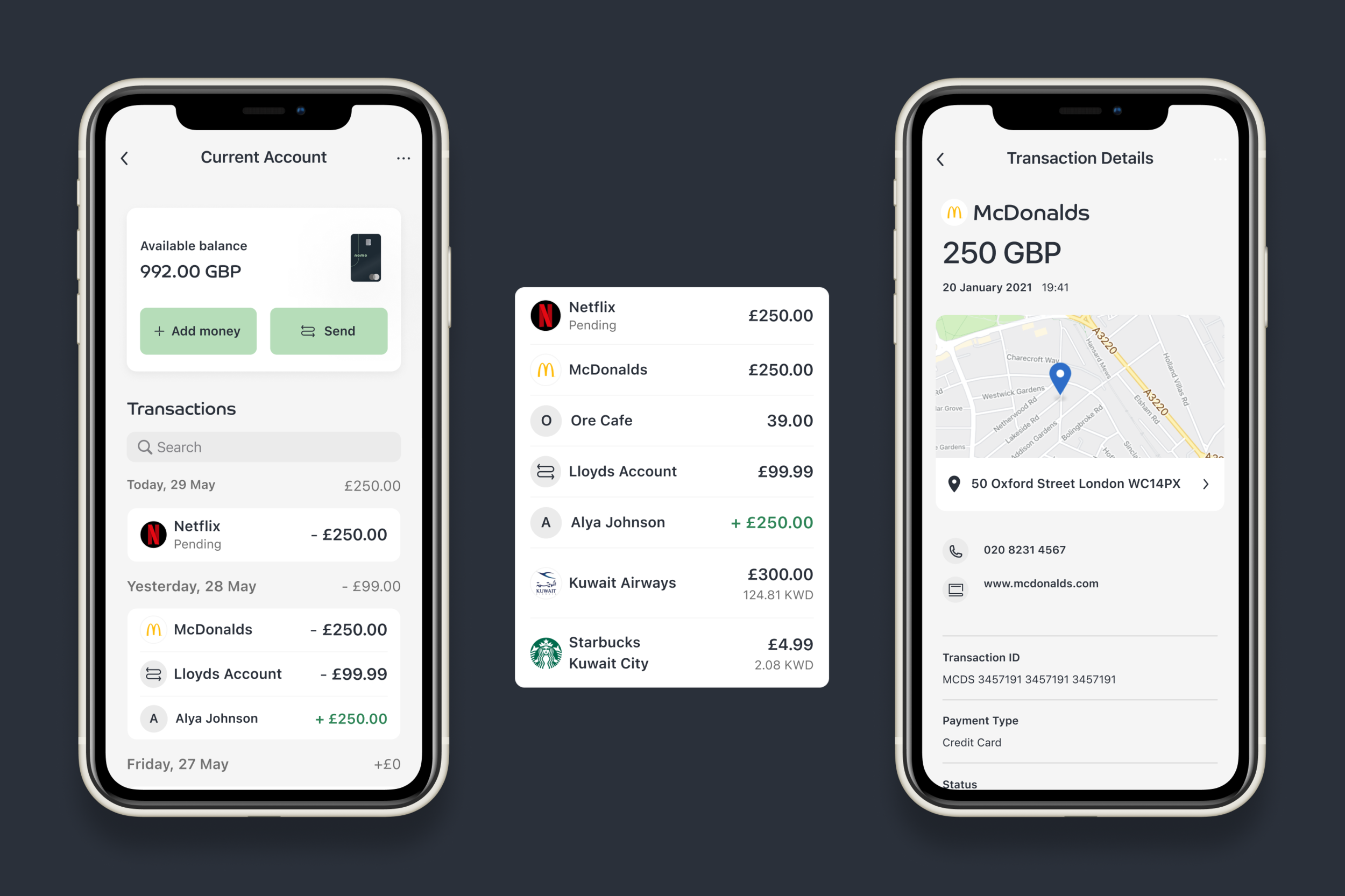
Improving the look and feel and content of the available balance area
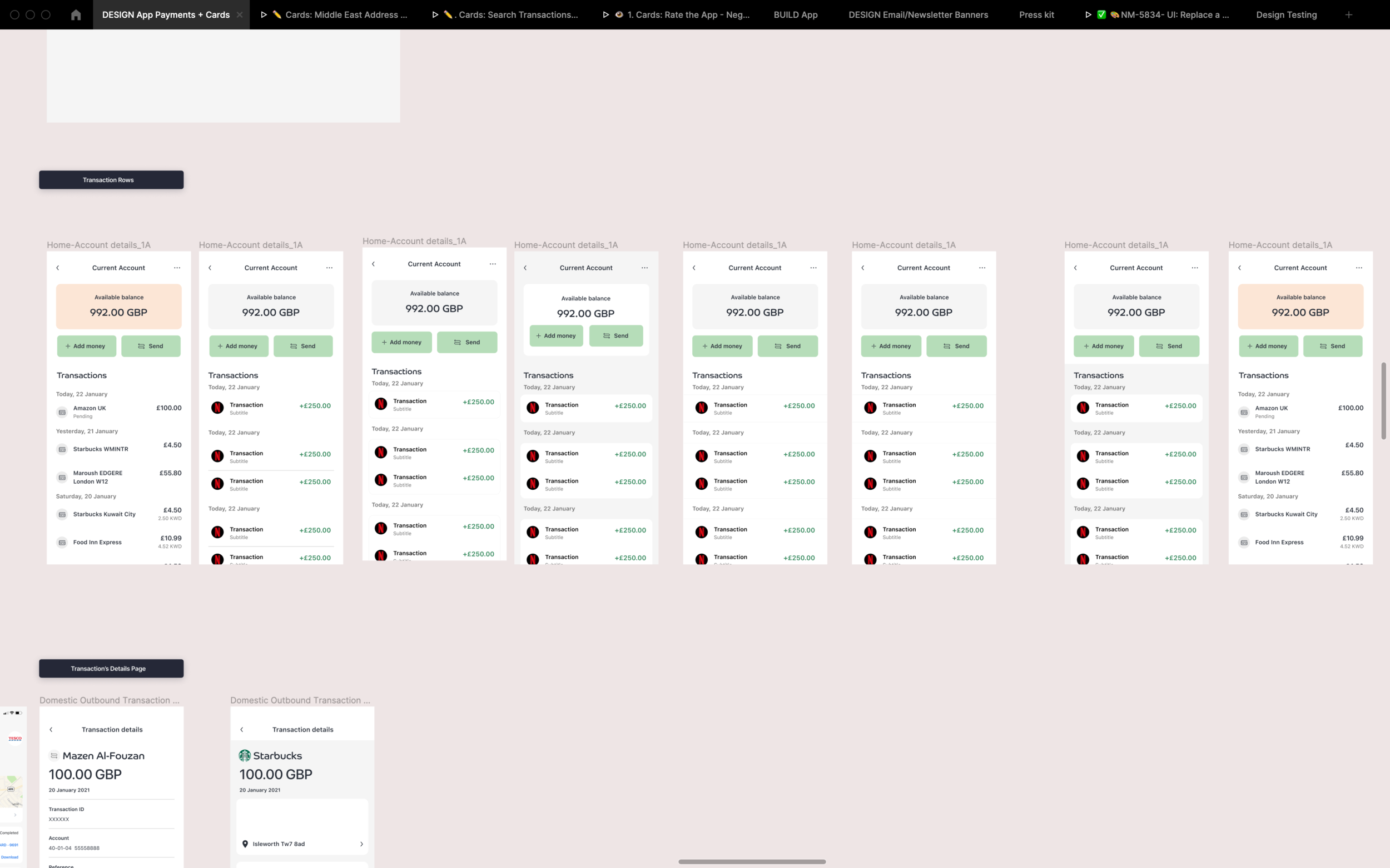
Adding merchant logos so users can quickly and clearly identify transactions
Adding “days of the week” to the headers in the transaction
A more visually appealing row and background style
Including “Search” for customers to find previous transactions
Benefits
Customer Benefit
Cardholders have greater clarity into their transactions.Business Benefit
Reduction in costly disputes of valid transactions due to the user being able to recognise their transactions more easily
Design Process (UI)
-
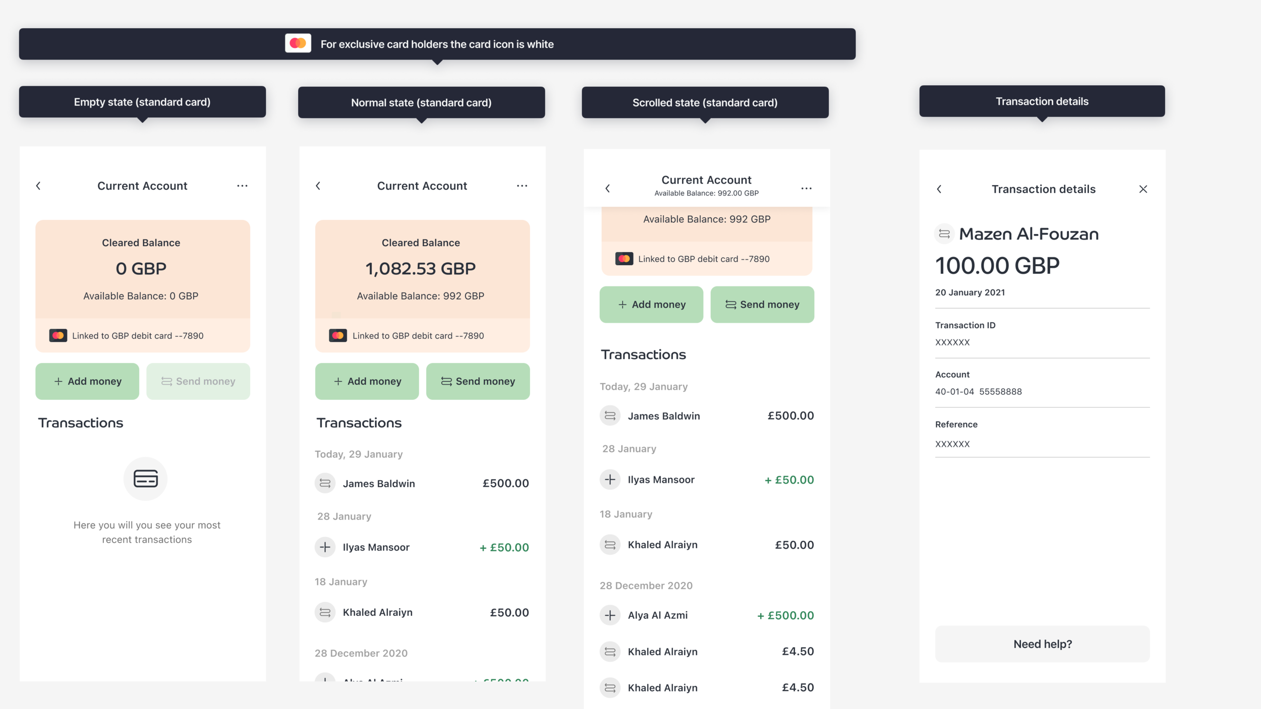
Design Audit of current design
Competitor Research -
UI Exploration
UI Testing of two version -
High Fidelity UI
Delivery
My approach
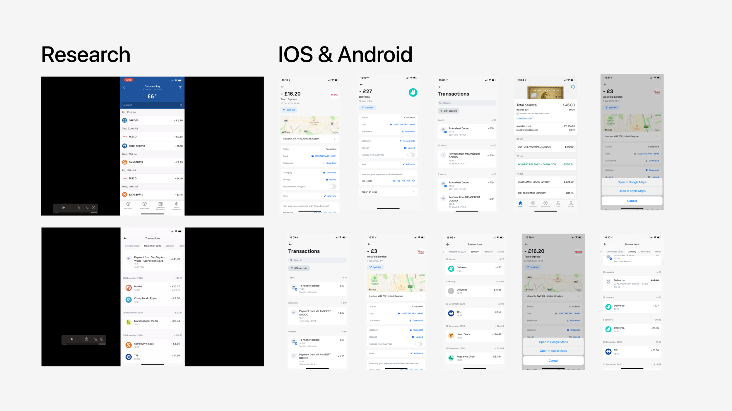
initiated the project by gathering qualitative research through user interviews, which highlighted the need for clearer transaction insights. I also conducted benchmarking against competitors to understand best practices in transaction presentation.
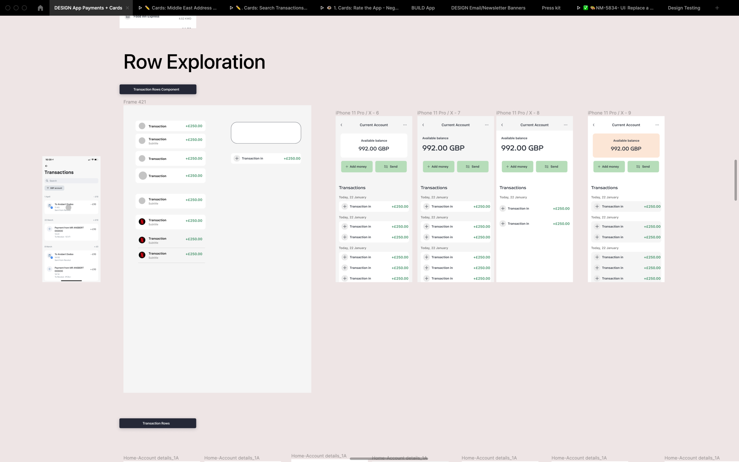
What was my strategic thinking behind my design decisions?
I focused on delivering a straightforward user interface that presented enriched transaction information without overwhelming the user. By prioritising clarity and relevance, I aimed to enhance the user's financial awareness and promote better financial management.
User Testing
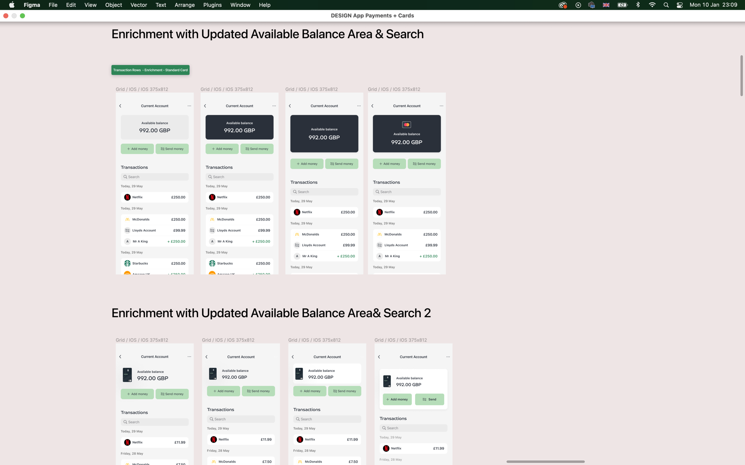
Option 1: Dark Available balance area.
(With improved transaction rows)
Option 2: Light Available balance area
(card art, with improved transaction rows, daily total spend)
Validate two design options for transaction enrichment (App)
Balance area review:
Option 2 was the preferred with 3/5 users followed by no preference (2/5), most people provided feedback and comments about making the balance area on Option 1 smaller as the focus on this page should be the transaction list.
Outgoing and incoming transactions review
Option 2 was again preferred, as users felt that including details about your daily spending was beneficial to them. It made sense to also add the minus signs to outgoing transactions. It would be also beneficial to improve this page further in future by improving the search area.
To note: Everyone understood the entry point to transactions area from the My Wealth screen
Final UI
Outcome
The transaction enrichment feature received positive feedback during usability testing, indicating that users found the additional context helpful. This success laid the groundwork for future enhancements in the app.
Learnings
The project reinforced the importance of user feedback in the design process. By iterating based on user input, I was able to create a more effective and user-friendly feature.
Key Results
Increased user engagement with transaction details by 40% following the introduction of the enrichment feature.
Reduced enquiries related to transaction confusion, demonstrating the effectiveness of the enhancements.
Positioned the app as a more comprehensive financial management tool, improving overall user satisfaction.
Like what you’ve seen?
Feel free to reach out, and let's see how I can help meet your design needs or fit into your team. Let's chat!


