Healthcare App - BIMA
Providing Ghanaians with easier access to medical healthcare
My Role: Visual Redesign | Tools: Sketch
Overview
BIMA’s Ghana Android mHealth app is designed to provide Ghanaians with easier access to medical healthcare. The app offers features such as booking appointments, accessing health records, and receiving medical advice, aiming to bridge the gap in healthcare accessibility and improve overall health outcomes.
Challenge
While the app is highly beneficial, several design issues have been identified that prevent it from being easy to use.
Currently BIMA’s existing app had a cluttered homepage, inconsistent navigation, and lacked an intuitive user flow, which made it difficult for users to navigate and use the app effectively. The challenge was to address these issues and create a streamlined, user-friendly design.
Solution
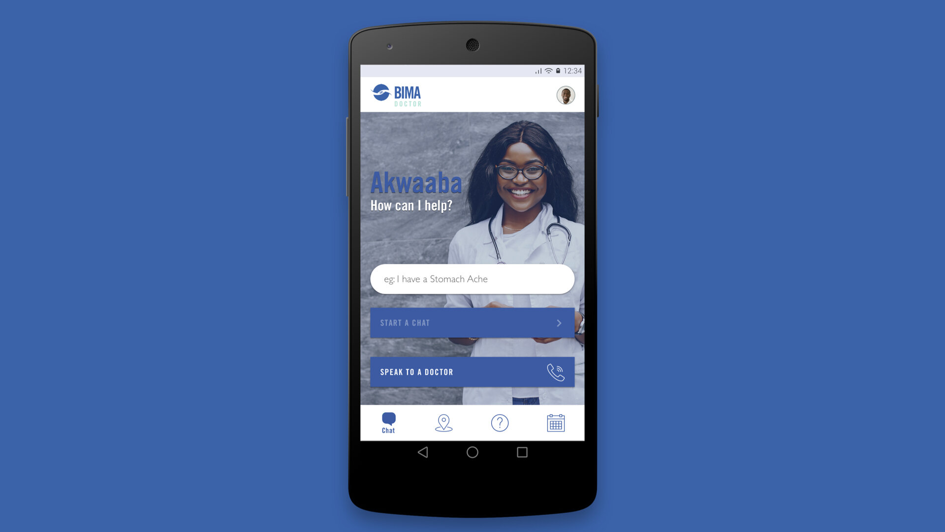
By conducting a thorough review of the current design, performing competitor research, and implementing a user-centered design approach, I created a new, intuitive design for the BIMA app. The main improvement was the decluttering of the homepage to make it more welcoming and straightforward.
Design Process
-
Design Audit
Identifying Key Features -
Competitor Research of similar apps
UX Flow & Low Fidelity Sketches -
UI Design
Prototyping
Final implementation
Explore Current Design Issues
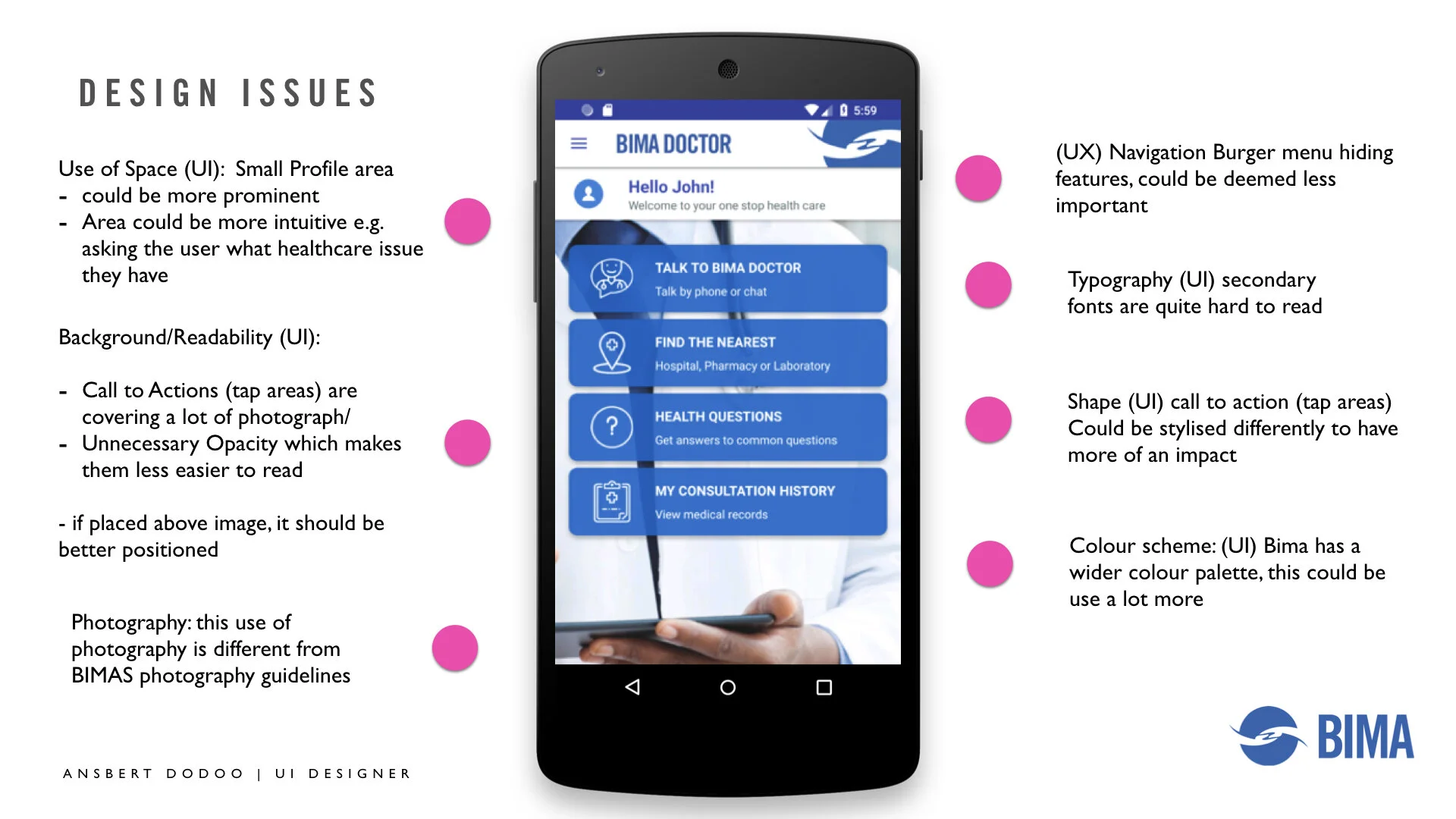
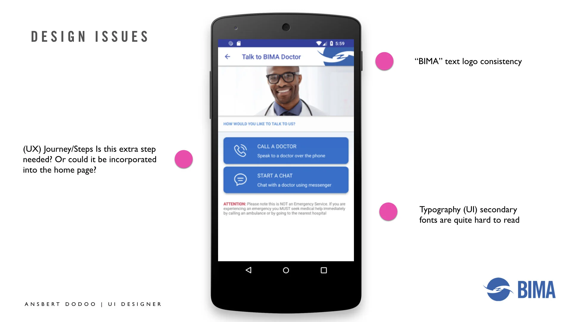
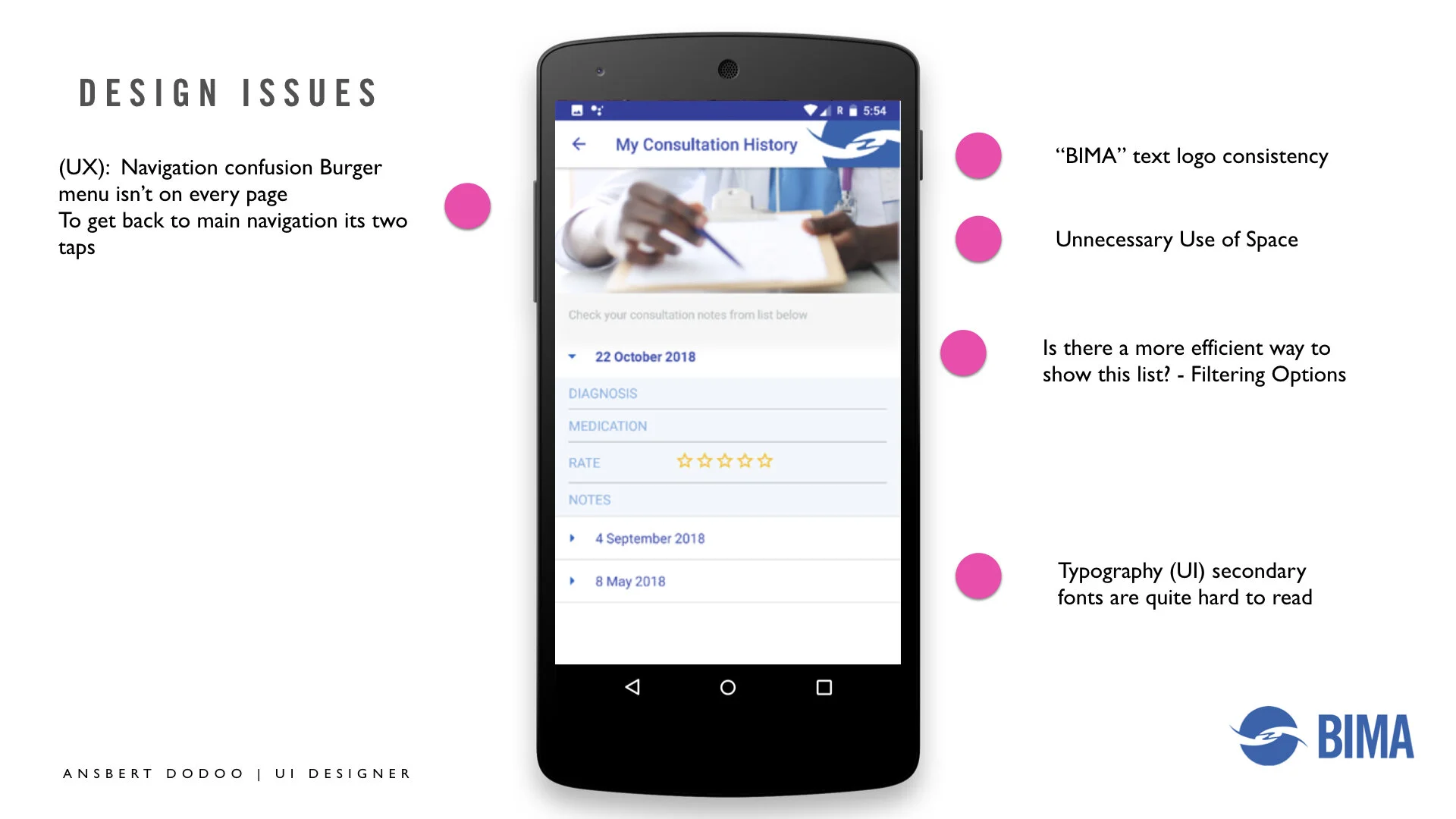
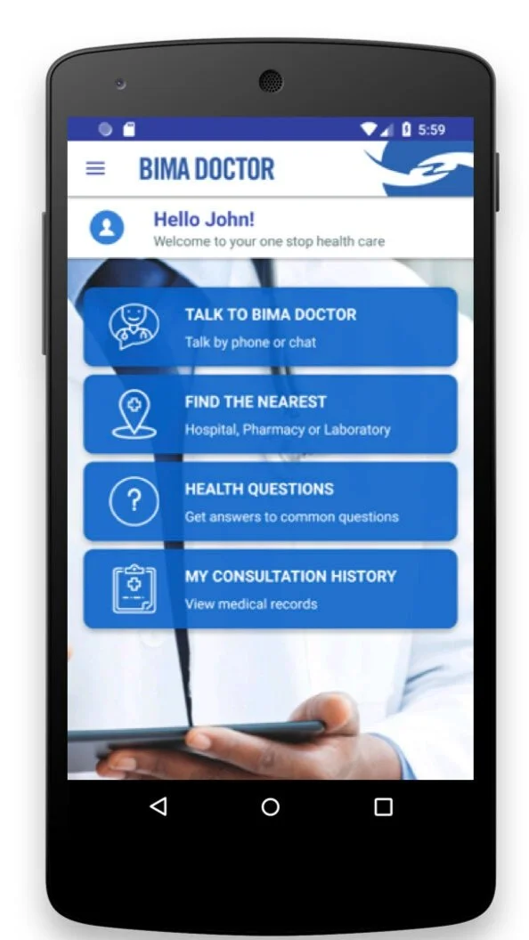
Review Current Design: Upon reviewing the current design, I identified several key areas that needed improvement. The existing app was cluttered, had a poor information hierarchy, inconsistent branding, complicated navigation, inefficient user flow, and lacked visual appeal and accessibility.
Key Design Changes Needed:
Simplify the interface to reduce clutter.
Establish a clear information hierarchy.
Align design with updated brand identity.
Simplify navigation structure.
Improve user flow for efficiency.
Enhance visual appeal with modern design elements.
Ensure accessibility for all users.
Improve feedback and error handling.
Update outdated design elements.
Optimise the use of screen space.
Competitor Research
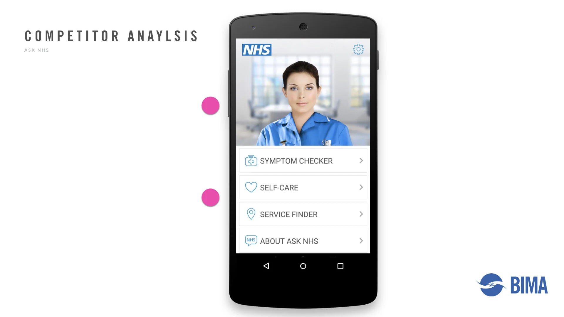
Research Similar Companies: To inform the redesign, I conducted thorough research on competitors' apps. This helped identify best practices and innovative features that could be incorporated into the BIMA app. Key takeaways included:
Intuitive navigation structures.
Clean, modern design aesthetics.
Effective use of branding elements.
Features that enhanced user engagement and ease of use.
User Flow and Low Fidelity Sketches
Drawing from the competitor research and identifying design flaws in the existing app, I began crafting initial sketches and user flows for the new design. This foundational work aimed to address specific issues and integrate best practices from the industry. Some of the main differences introduced in the new design included:
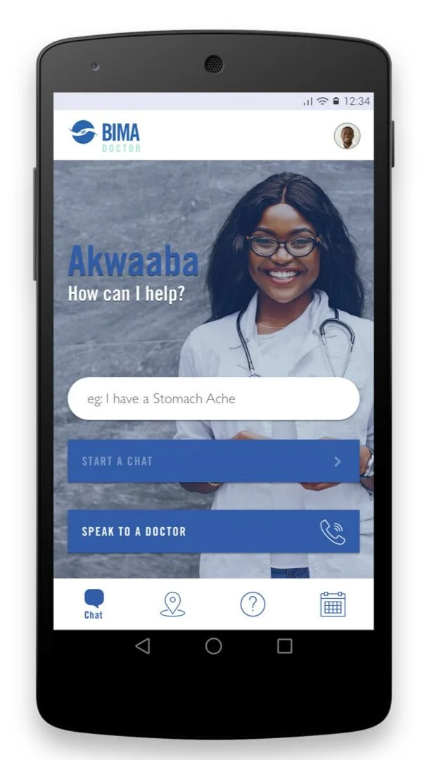
Decluttered Homepage: The main improvement I implemented was the decluttering of the homepage to create a more welcoming and straightforward experience. This change aimed to simplify the user’s journey from the moment they opened the app
Streamlined Navigation: Simplified the navigation structure to ensure users could easily find key features and information without unnecessary steps.


UI Design
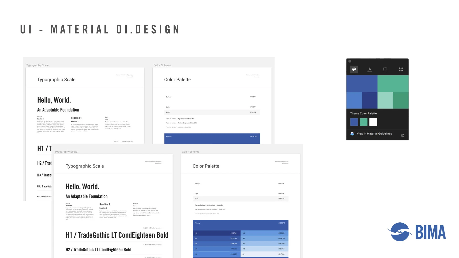
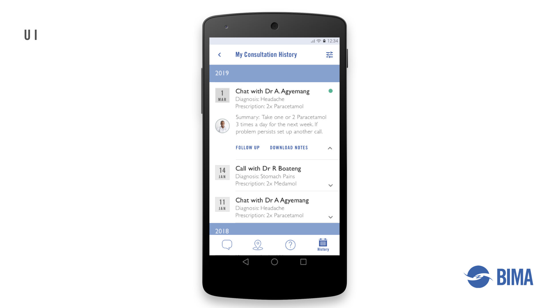
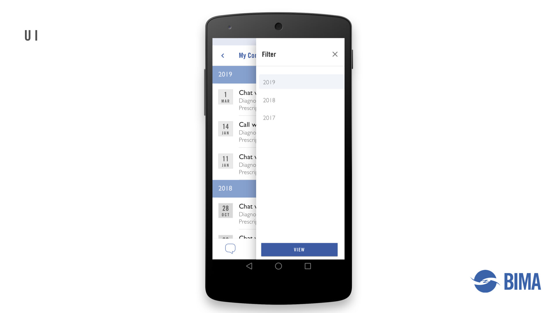
UI & Material Design Exploration:
I focused on creating a visually appealing interface that aligned with BIMA’s brand identity. BIMA already had brand guidelines in place, which streamlined the process of developing UI elements for the app. This foundation allowed me to explore various UI and material design elements to find the best fit for the app. My goal was to ensure that the design was not only functional but also aesthetically pleasing and reflective of BIMA’s values.
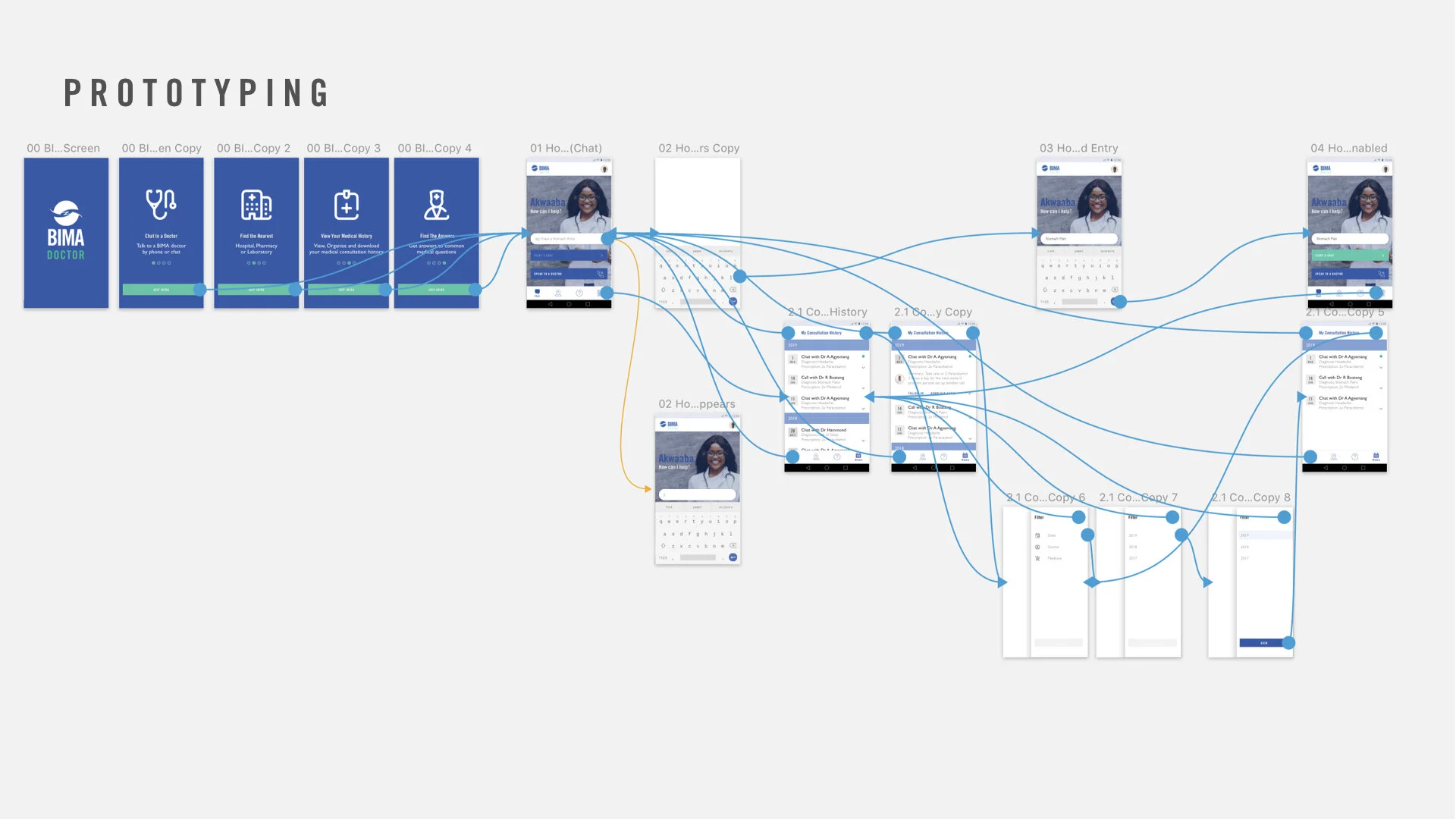
Prototyping
I developed interactive prototypes to test the new design. These prototypes allowed for practical testing of the new features and user flow, ensuring that the design changes were effective.
Final Designs
Finally, I presented the redesigned BIMA app to the team, showcasing the improved user flow, simplified interface, and enhanced visual design. The presentation highlighted how the new design addressed the key issues identified in the initial review and aligned with BIMA’s brand identity.
Home
BEFORE
AFTER
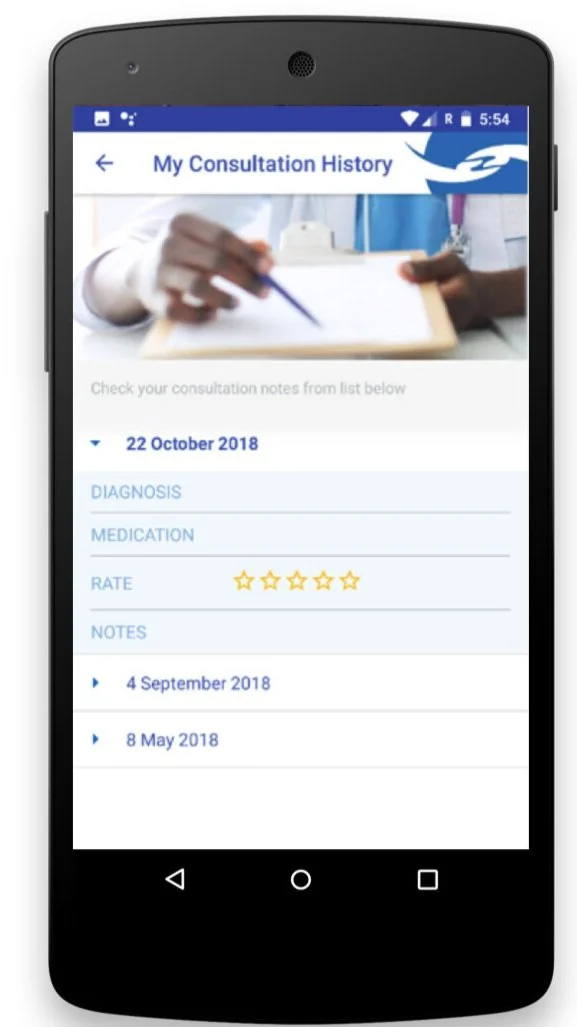
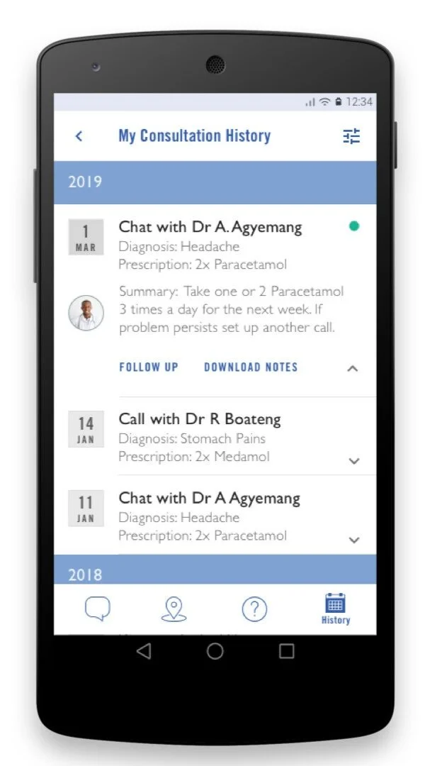
Consultation History
BEFORE
AFTER
Outcome
The redesigned BIMA app received positive feedback for its simplified navigation and improved user experience. The decluttered homepage and consistent navigation contributed to a more intuitive and user-friendly interface.
Learnings
I learned the importance of decluttering and simplifying the user interface to enhance the user experience. Streamlining the design can significantly improve usability.
I discovered how competitor research can provide valuable insights and guide design improvements. Understanding industry standards helps in creating a competitive product.
I found the effectiveness of iterative design and prototyping in developing a user-centric product. Continuous feedback and iteration are crucial for refining the design.
Key Results
Improved user retention due to enhanced user experience and simplified navigation.
Increased app usage as a result of a more intuitive interface and decluttered homepage.
Like what you’ve seen?
Feel free to reach out, and let's see how I can help meet your design needs or fit into your team. Let's chat!

