Payee Management - Nomo Bank App
Improve the users experience by allowing them to manage their Payee’s details.
My Role: Product Design (UX/UI) | Tools: Figma
Challenge
At Nomo, there wasn't a way for users to manage or amend their saved recipients' details. This limitation could lead to a very long list of recipients without a way for users to delete them. After benchmarking against the latest challenger and traditional banks, we explored the best way to improve this area.
Who I worked with
Main Squad - Payment’s Squad
Product Owner - Main Stakeholder
Technical Lead & Engineers
UX Researcher

Solution
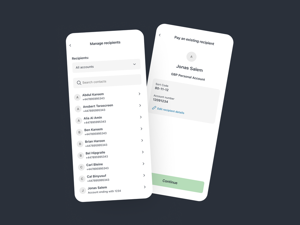
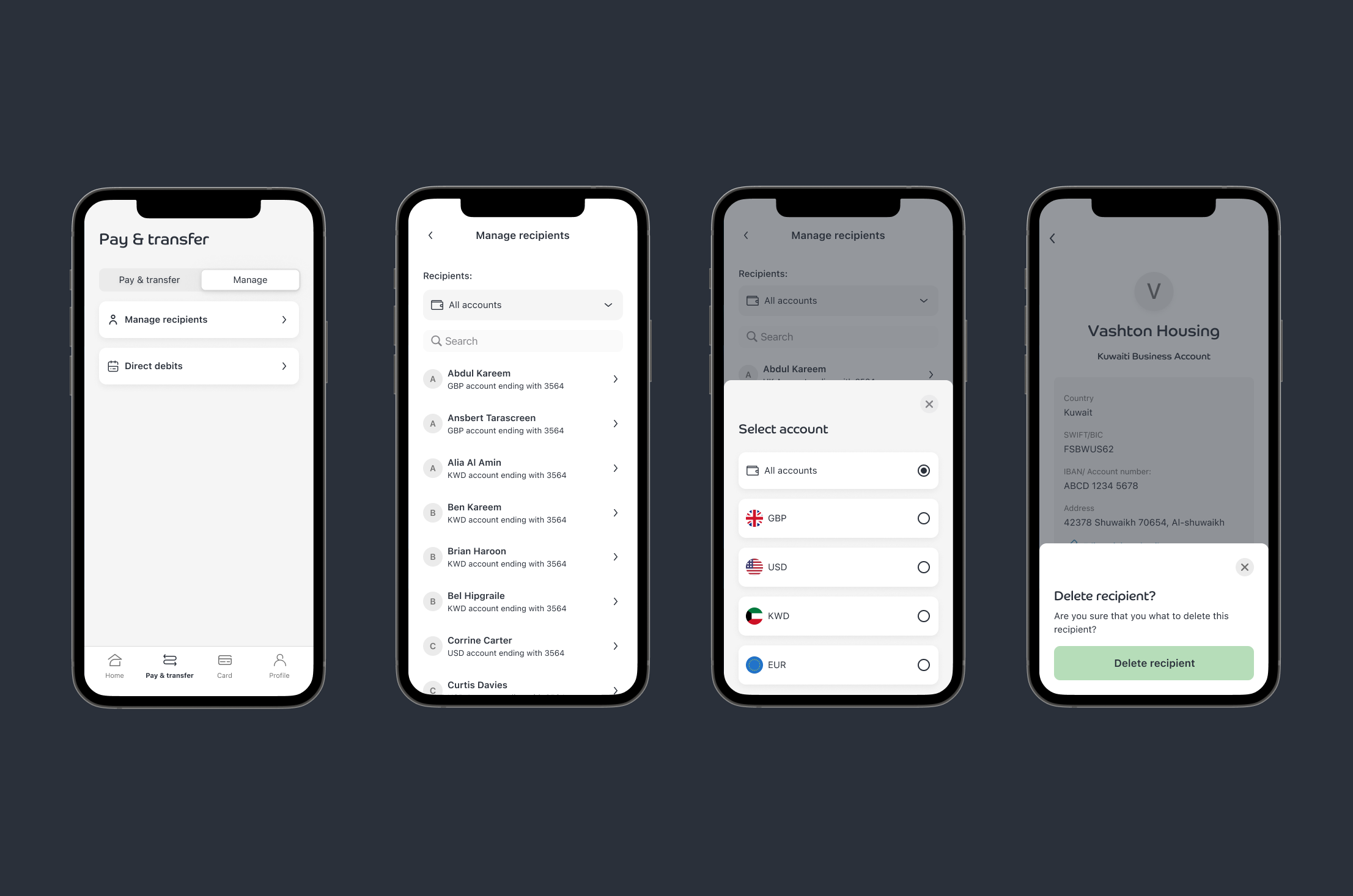
A new manage recipient area for users to search, edit, and delete their list of recipients.
The option to edit recipient details of existing recipients within the payment flow.
The ability to delete recipients.
Benefit
Implementing a comprehensive payee management system would allow users to search, edit, and delete their recipients, streamlining the payment process and enhancing user experience.
Design Process
-
Collaborate with stakeholders to clarify business goals.
Catch up with engineers and developers, to keep them well informed from the very beginning of the process.
-
I dive into understanding the problem and user needs through user research, competitor analysis, and gathering qualitative data.
Benchmarking also plays a key part
-
Next I would brainstorming solutions. I create wireframes and low-fidelity prototypes to explore potential layouts and features.
During this phase, I also collaborate with stakeholders to generate and refine ideas.
-
I create prototypes and conduct usability testing to gather feedback from users.
I iterate based on this feedback to ensure the design is intuitive and user-friendly.
-
Iterations & High Fidelity UI
Design Critique & Feedback
Collaboration with developers to ensure smooth handoff
Delivery & Design System sync
Presentation
My approach
User Research: We conducted extensive research and benchmarking with both challenger and traditional banks to understand the best practices in payee management. This helped us identify key features and usability improvements.
Design Concepts and Iterations: I mapped out the user flow for managing recipients, ensuring a seamless experience from accessing the manage recipients area to editing or deleting recipient details. This included entry points, navigation paths, and action steps.
Prototyping and Usability Testing: We conducted user testing to validate our designs and was given valuable insight into which concepts was easier for the user to use.

What was my strategic thinking behind my design decisions?
I recognised the need for a dedicated management area for tasks like adding, editing, or deleting payees. However, I also understood that users may need to make quick edits during the payment flow, such as when a recipient’s account details or name changes.
To address this, I ensured that users could still edit payee details directly within the payment process, as these updates are often crucial for completing the transaction.
While the primary focus during the payment flow is making a payment, this approach provides flexibility without overwhelming the user with unnecessary options.
Major management tasks are kept in a separate area, maintaining a streamlined experience for both payment and management needs.
Edit Recipient
Manage Recipients
Usability Testing
Editing Recipient Details within Payment Flow:
Users were given the option to amend recipient details during the payment process. This feature tested very well, with 5 out of 5 users finding the editing experience easy.
Manage Recipients Area:
We introduced a "Manage Recipients" section and explored various ways to help users find and delete their recipients. Users preferred the filtering option, which focused on filtering contacts by the currency account they were added to. Deleting contacts was found to be straightforward, with users easily navigating to the new recipient details page to edit or delete entries.
UI Iterations and Delivery
Based on feedback from user testing, we iterated on our designs:
Manage Recipients Entry Point:
To address user confusion regarding the location of "Manage Recipients," we consolidated the "Manage Payments" tab into a broader "Manage" tab, housing the manage recipients feature there.
Add a New Recipient:
We maintained the option to add a new recipient within the payment flow for a more streamlined experience.

Outcome
The redesign of the Payee Management feature significantly improved user interactions. By separating complex management tasks from the payment flow, while still allowing quick edits, we reduced confusion and user complaints. This led to a more positive experience overall.
Learnings
I learned the importance of balancing flexibility and focus. Users appreciate the ability to make quick edits during payments, but a clear, streamlined flow is essential to maintain engagement. Feedback from usability testing reinforced the need for a design that accommodates real-world scenarios.
Key Results
As a result of these enhancements, we achieved a 25% increase in user engagement, a 40% improvement in task completion rates for adding and editing payees, and a 30% reduction in payment errors. These improvements not only enhanced user satisfaction but also eased the burden on customer support, benefiting the business as a whole.
Like what you’ve seen?
Feel free to reach out, and let's see how I can help meet your design needs or fit into your team. Let's chat!


