Amex Mobile App
Use Points towards Purchases
My Role: UI Design | Tools: Sketch
Challenge
On the US mobile app for Amex, their is a feature allowing users to ‘use points’ towards their charges (purchases/transactions) - essentially, if a customer has purchased something on their credit card, they have the option to use these points to cover that transaction - in essence a part payment of paying off their full credit statement.
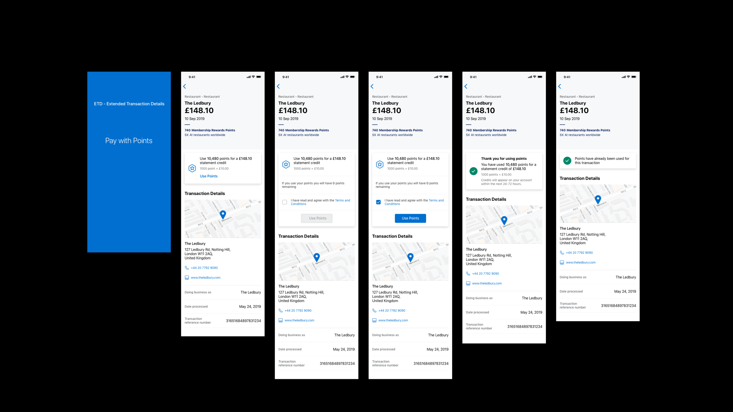
The existing ‘Use Points’ feature within the transaction details area of the American Express US Mobile App was cluttered, with some information causing confusion for customers.
The positioning of the feature led to a jumpy user experience, and its prominence overshadowed other options on the page.
Who I worked with
Product Owner - Main Stakeholder
Technical Lead & Engineers
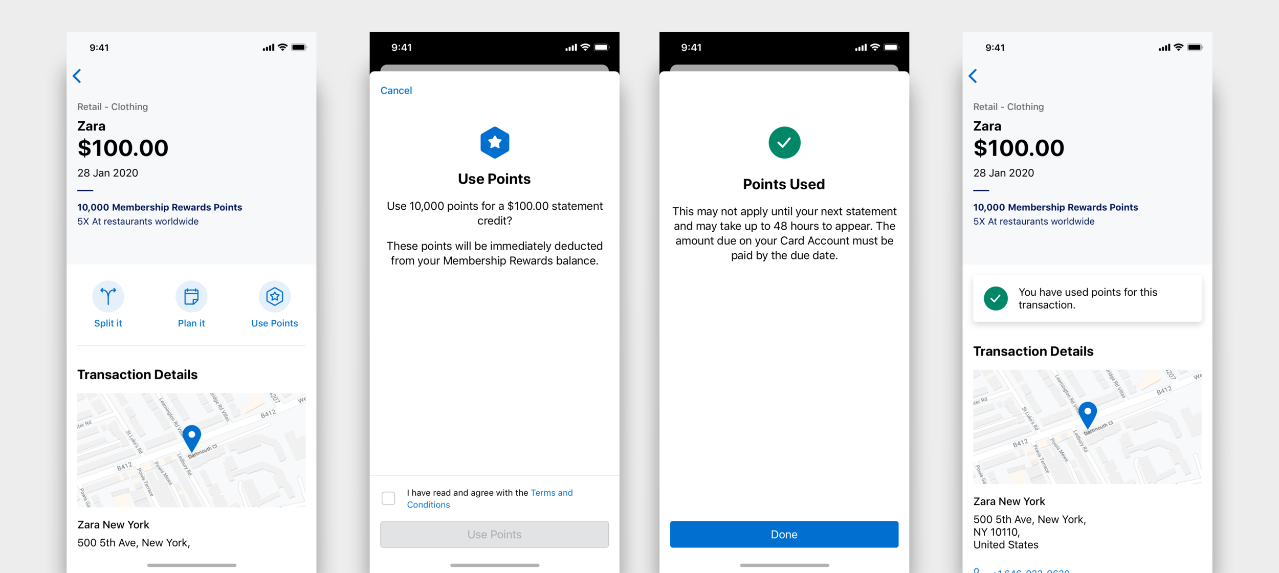
Solution
We redesigned the Pay with Points feature by:
leveraging the new Action Ribbon Design to manage multiple actions more effectively, addressing technical constraints, and making the information easier to read for confused users
Benefits
Improving the Pay with Points feature would declutter the user interface, provide a smoother user experience, and integrate seamlessly with other features using the new Action Ribbon Design.
Design Process
-
Collaborate with stakeholders to clarify business goals.
Catch up with engineers and developers, to keep them well informed from the very beginning of the process.
-
I dive into understanding the problem and user needs through user research, competitor analysis, and gathering qualitative data.
Benchmarking also plays a key part
-
Next I would brainstorming solutions. I create wireframes and low-fidelity prototypes to explore potential layouts and features.
During this phase, I also collaborate with stakeholders to generate and refine ideas.
-
I create prototypes and conduct usability testing to gather feedback from users.
I iterate based on this feedback to ensure the design is intuitive and user-friendly.
-
Iterations & High Fidelity UI
Design Critique & Feedback
Collaboration with developers to ensure smooth handoff
Delivery & Design System sync
Presentation
My approach
I focused on redesigning the "Use Points" feature in the American Express US mobile app. The existing feature allowed customers to use their points towards specific transactions but was cluttered and caused confusion. My goal was to streamline the user experience, ensuring the feature was clear and easy to use without overwhelming other important elements on the page.
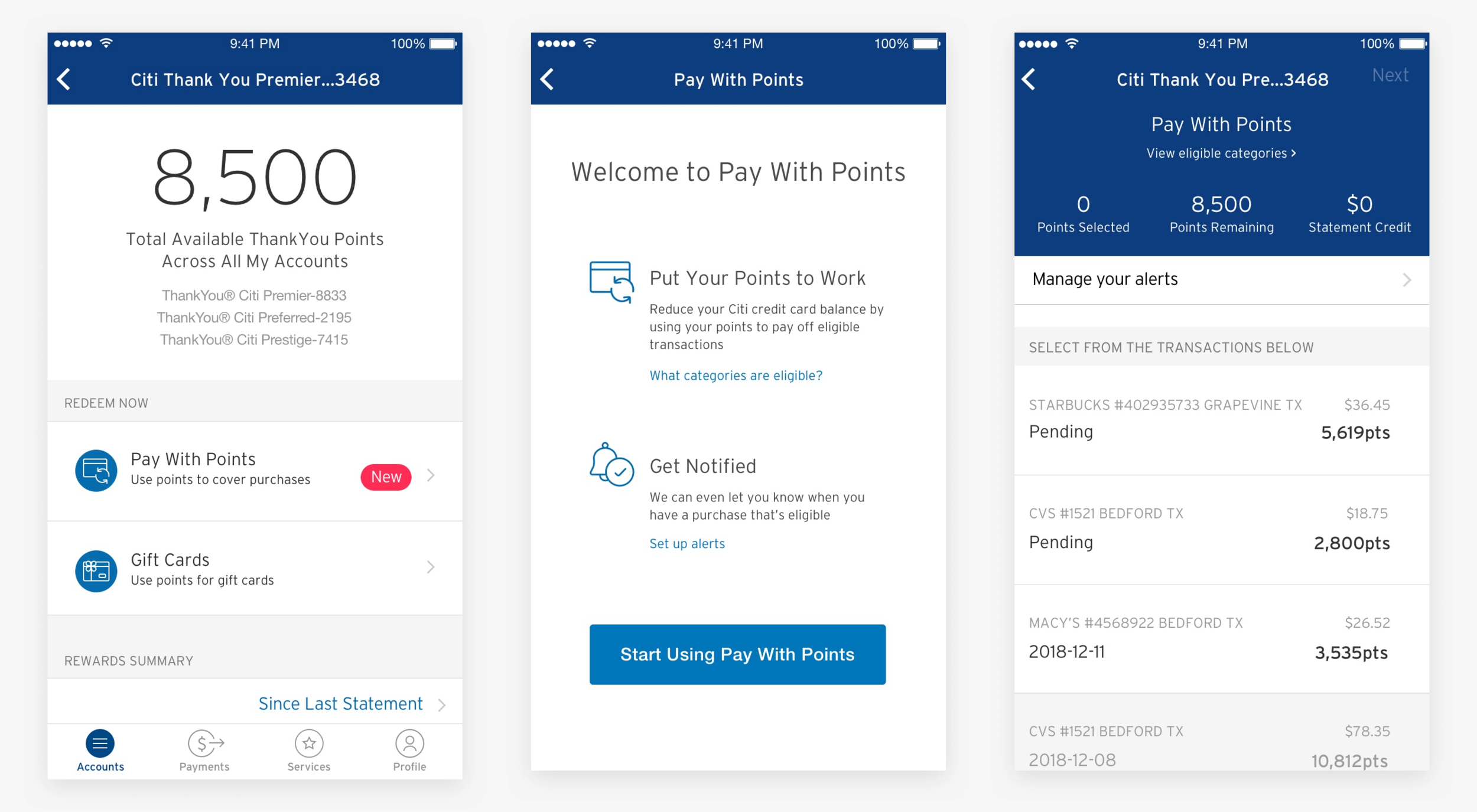
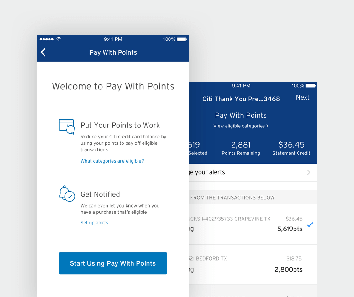
I began by conducting research and benchmarking against competitors in the credit card and financial app space, examining how other platforms handled rewards and points redemption. This helped me identify best practices and informed the simplification of the "Use Points" feature, ensuring it was intuitive and accessible for users.
What was my strategic thinking behind my design decisions?
My main priority was to improve the clarity and prominence of the feature while balancing it with the overall transaction page
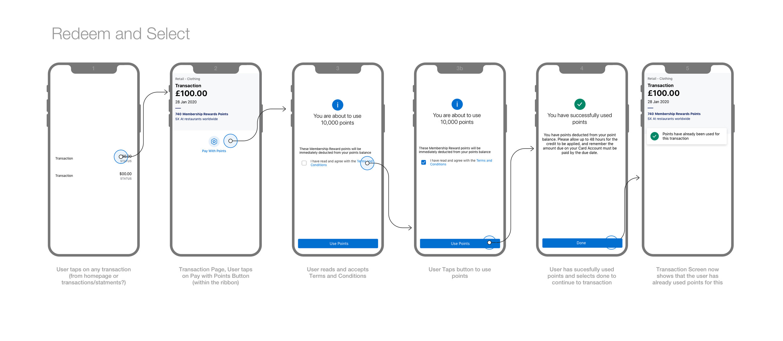
An action ribbon was already in place for other options that the user could do with their transaction, such as Plan, or Splitting the payment with someone else - To improve the usability of this area, I thought it would be best to look into making the action ribbon more dynamic and intuitive.
So, depending on the specific transaction, relevant action buttons, like "Use Points," would appear only when applicable. I aimed to test these new designs and layouts through usability testing to validate my design choices.

Usability Testing & UI
Through usability testing, we identified that users were initially unsure of how to access and use the "Use Points" option effectively. By simplifying the layout and repositioning key elements, users found it much easier to engage with the feature.
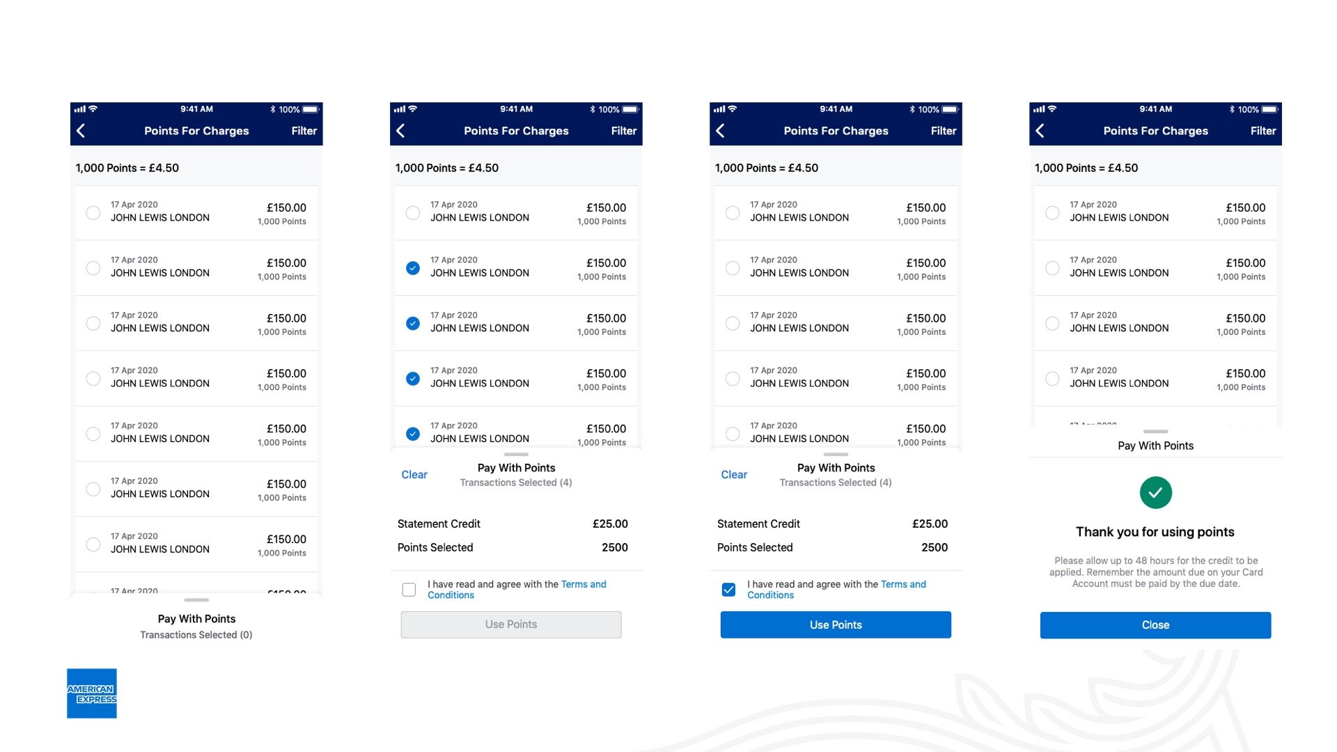
The UI updates, such as more intuitive placement of the points option and clearer calls to action, were directly informed by this testing process.


Outcome
The redesigned feature made it significantly easier for users to use points against their transactions, leading to an improved user experience. This simplification also reduced confusion and enhanced the visibility of other important options within the app.
Learnings
This project reinforced the importance of clear feature placement within a crowded interface. A well-thought-out layout can make complex actions feel more intuitive, reducing user frustration and improving overall engagement.
Key Results
The updated design led to a 25% increase in the usage of the "Use Points" feature and a reduction in customer support queries related to the process.
Overall user satisfaction with the transaction page improved by 15%, contributing to a smoother, more efficient mobile app experience.
Like what you’ve seen?
Feel free to reach out, and let's see how I can help meet your design needs or fit into your team. Let's chat!

