

Onmo Landing Page
Redesign of Onmo’s Landing Page
My Role: Product Design Exploration (UX/UI) | Tools: Figma & Webflow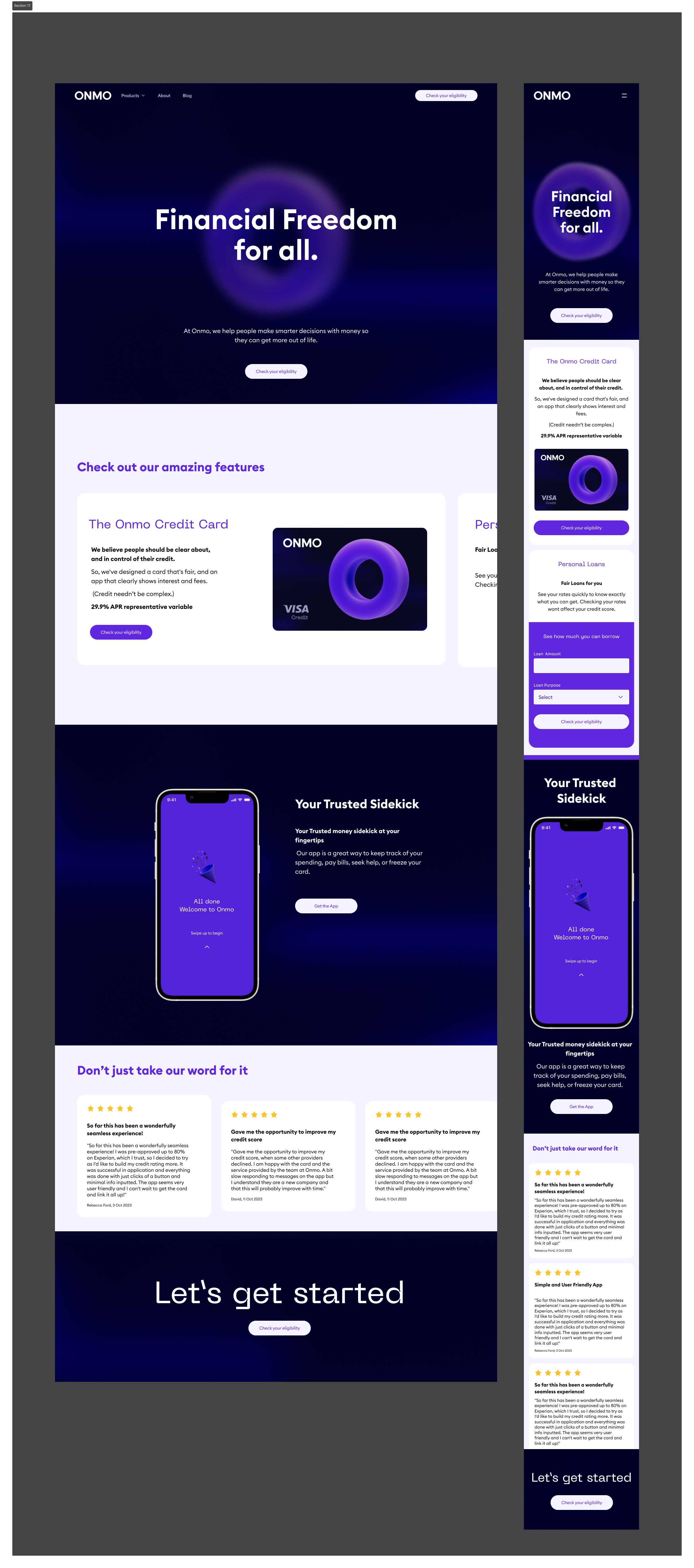
Design Process
-
Understand the business requirements, tech constraints and target audience
-
Explore current designs, the pre-improved landing page, conduct a design audit, summarise findings from fintech and disruptive companies, and review key sections from direct competitors.
-
Gather cool design inspiration, visually appealing layouts, and storytelling content to push our goals and increase conversion.
-
Create wireframes, review options with the Head of Design, and finalise the content and layout structure.
-
Develop low-fidelity UI designs, create visual assets, and incorporate motion design.
-
Test the design with users to gather feedback and make necessary adjustments.
-
Finalise the UI and build the landing page. Explore Webflow and other potential hosts.
Overview
Current Situation
Onmo has an existing landing page, but due to changing business requirements, we looked to revamp our proposition. The new landing page we were about to launch had teasers for potential future products like the "Debit Account" and "Business Account" however due to changes in business requirements, these products have become descoped. We opted to relook at our proposition, whilst at the same time making sure that whatever we design is consistent with the brand changes and redesign of our app.
Goal of the Landing Page
The aim of the new landing page is to transform visitors into customers by prompting them to take a specific action. Conducting a competitor analysis will help us pinpoint the best action our users should take.
Objectives and Understanding
Business Requirements:
Given the evolving nature of Onmo, certain key products that we had thought of including, were placed on a pre-designed version. We had included teasers for potential future products like "Debit Account" and "Business Account," though their launch remains uncertain. Therefore, the primary focus should be on our core product offerings, The Onmo credit Card, and the new mobile app. With this in mind the landing page design should still be adaptable to accommodate future feature additions.
It was also essential to maintain our brand's trustworthiness through the landing page.
Target Audience
To help our landing page, we looked at who our current target audience is and how they would use the website.
In essence, we are trying to capture new customers from the following areas:
Spontaneous Spenders: Primarily males (56%), aged 18-34, with lower incomes (~£44k). Impulsive spenders with poor money management, multiple credit cards, and high spending. Motivated by immediate access to funds and card design. Popular with banks like Barclays, Halifax, and Lloyds.
Credit Cautious: Slightly more females (53%), aged 45-54, with lower incomes (~£44k). Reluctant to incur debt, careful spenders who use credit cards minimally. Motivated by low interest rates and no annual fees. Prefer banks like Barclays, Halifax, and Natwest.
Money Managers: More likely females (56%), aged 55-64 and 18-24, with higher incomes (~£49k). Good at managing money, cautious spenders who save for big purchases, and adverse to debt. Motivated by reward schemes and reputable brands. Use banks like Barclays, Halifax, and HSBC.
Credit Confident: Equally split by gender, under 35, with higher incomes (~£49k). Comfortable with spending, high card usage for larger purchases. Motivated by brand reputation and innovative features. Favour banks like Barclays, Lloyds, and HSBC.
Our target audience includes diverse groups with distinct financial behaviours and motivations. By understanding these segments - we can tailor our landing page to attract new customers effectively, addressing their specific needs and preferences.
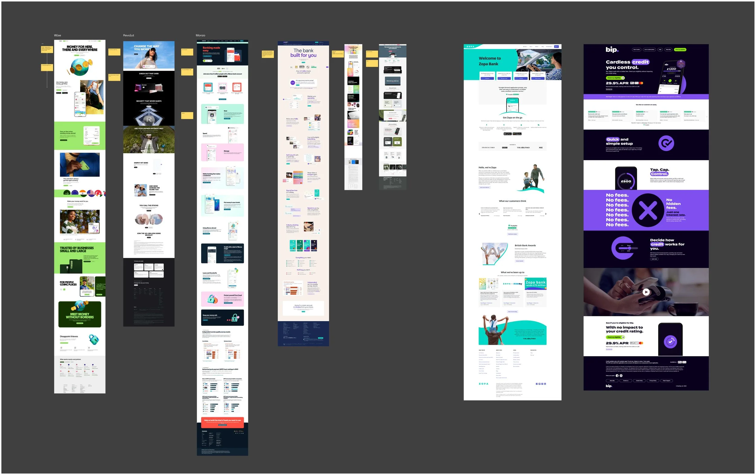
Researching Market and Competitors
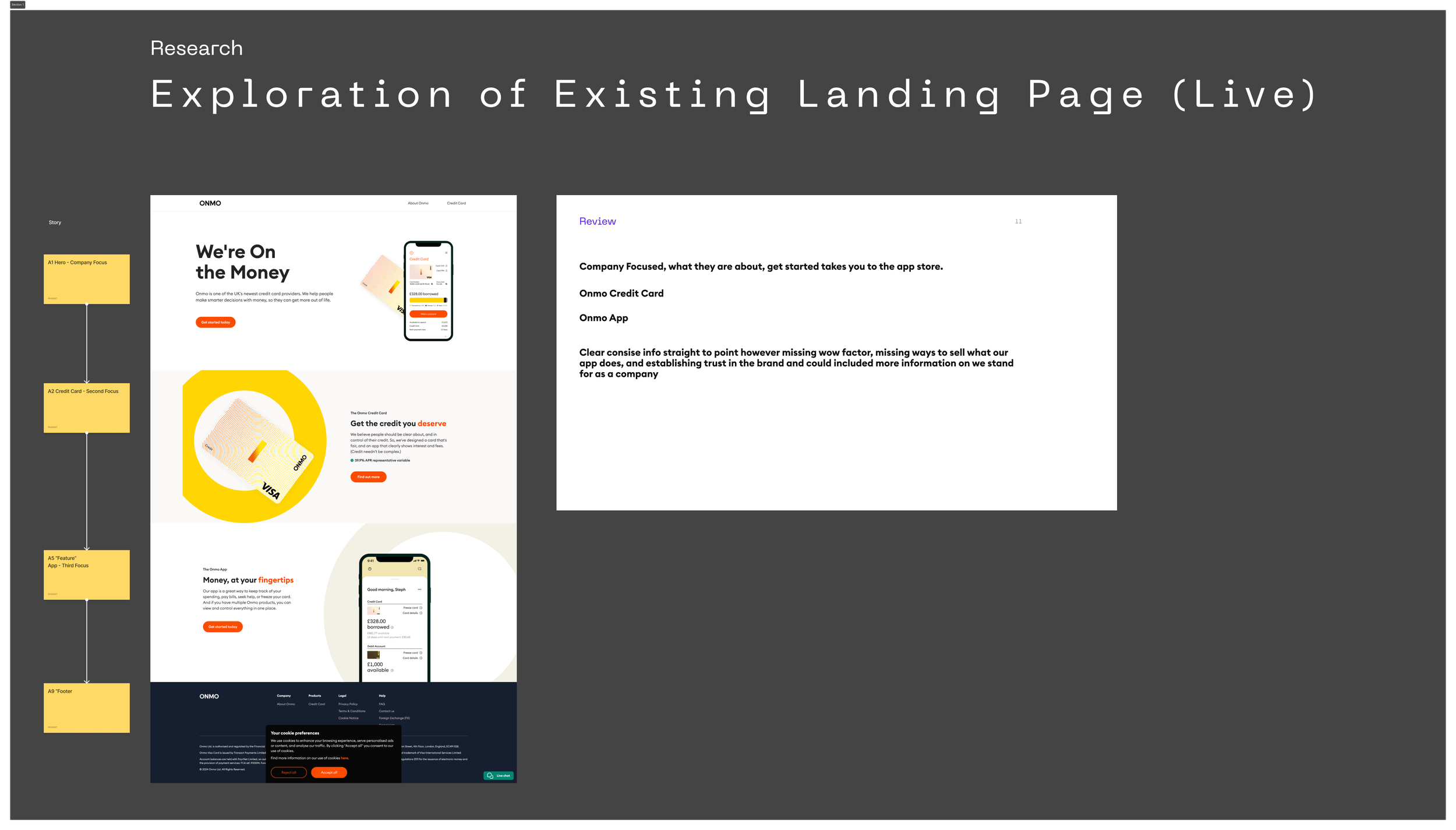
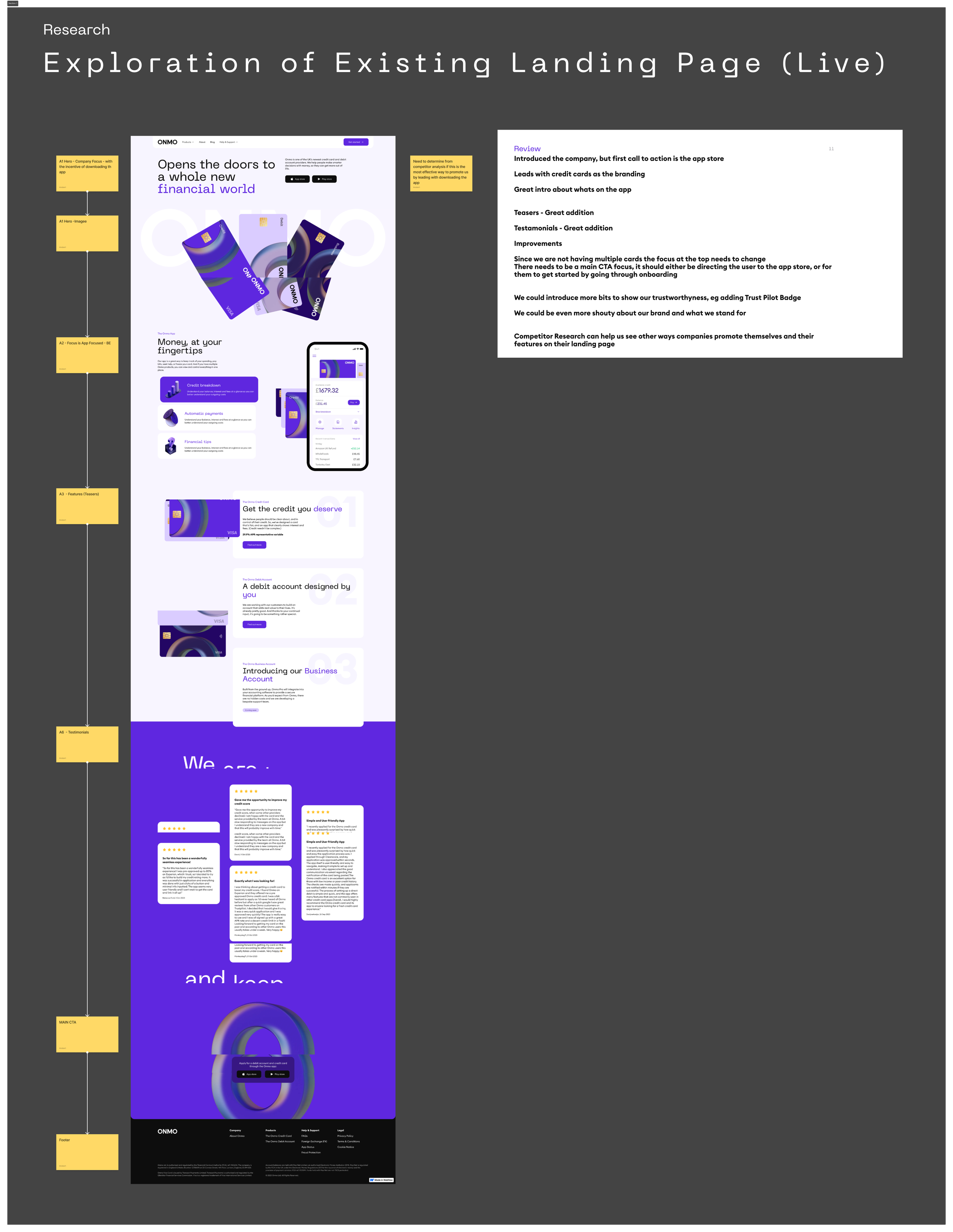
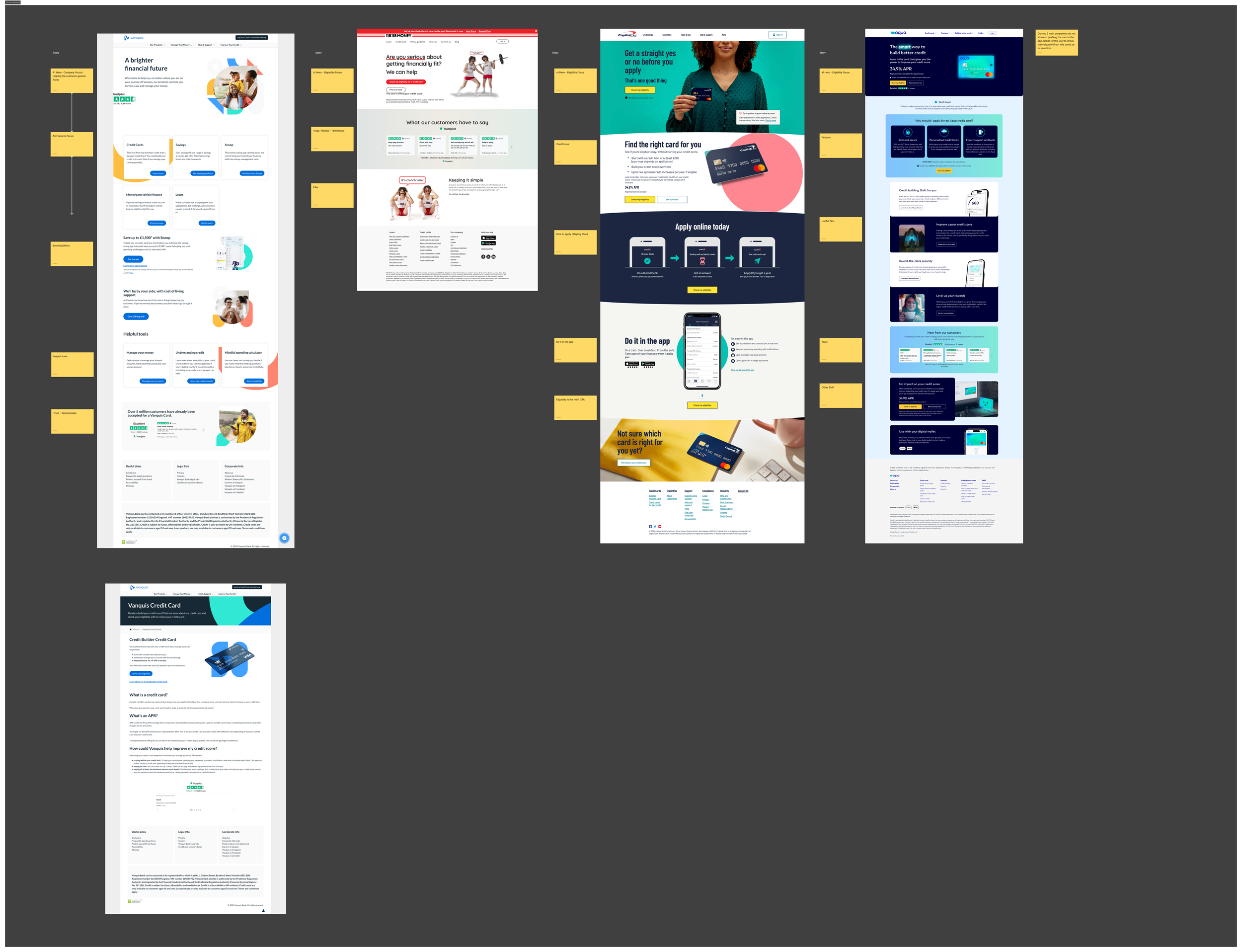
I explored the existing designs and the pre-improved landing page, conducted a design audit to research competitors and industry best practices, and summarised findings from fintech and disruptive companies. I reviewed key sections from direct competitors and disruptive companies to outline the most effective elements.
Direct Competitors
Disruptive Companies
Audit Summary
From the competitor analysis, we saw that there are a few different ways that our competitors are positioning themselves on their landing page
Eligibility Focused: Some apps prioritise getting visitors to check their eligibility before taking any further action.
Card Focused: Other sites concentrate on promoting their cards, aiming to attract users based on the card features.
App Focused: Certain competitors encourage users to download their app as the primary call to action.
Brand and Benefits Focused: For newer apps, it makes more sense to emphasise the brand and its benefits, as seen with Zing.
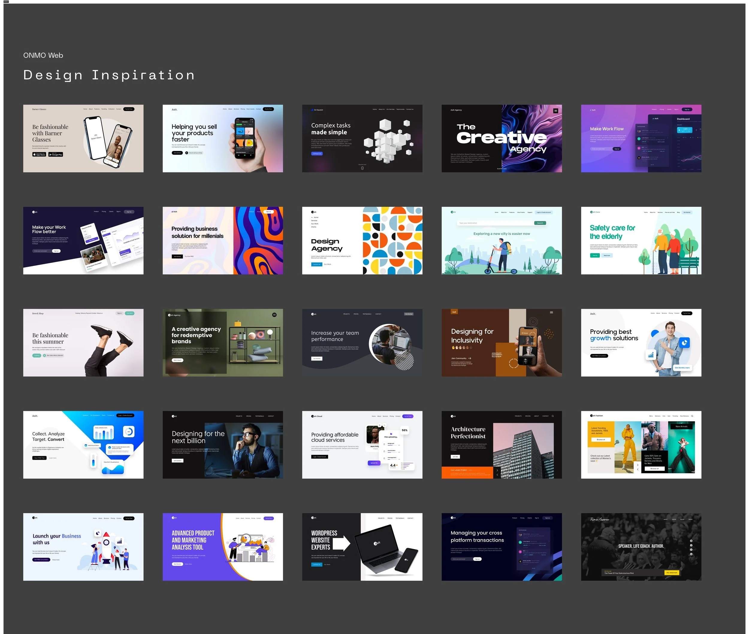
Design Inspiration
I gathered cool design inspiration, visually appealing layouts, and motion inspiration. I focused on storytelling content to push our goals and increase conversion.
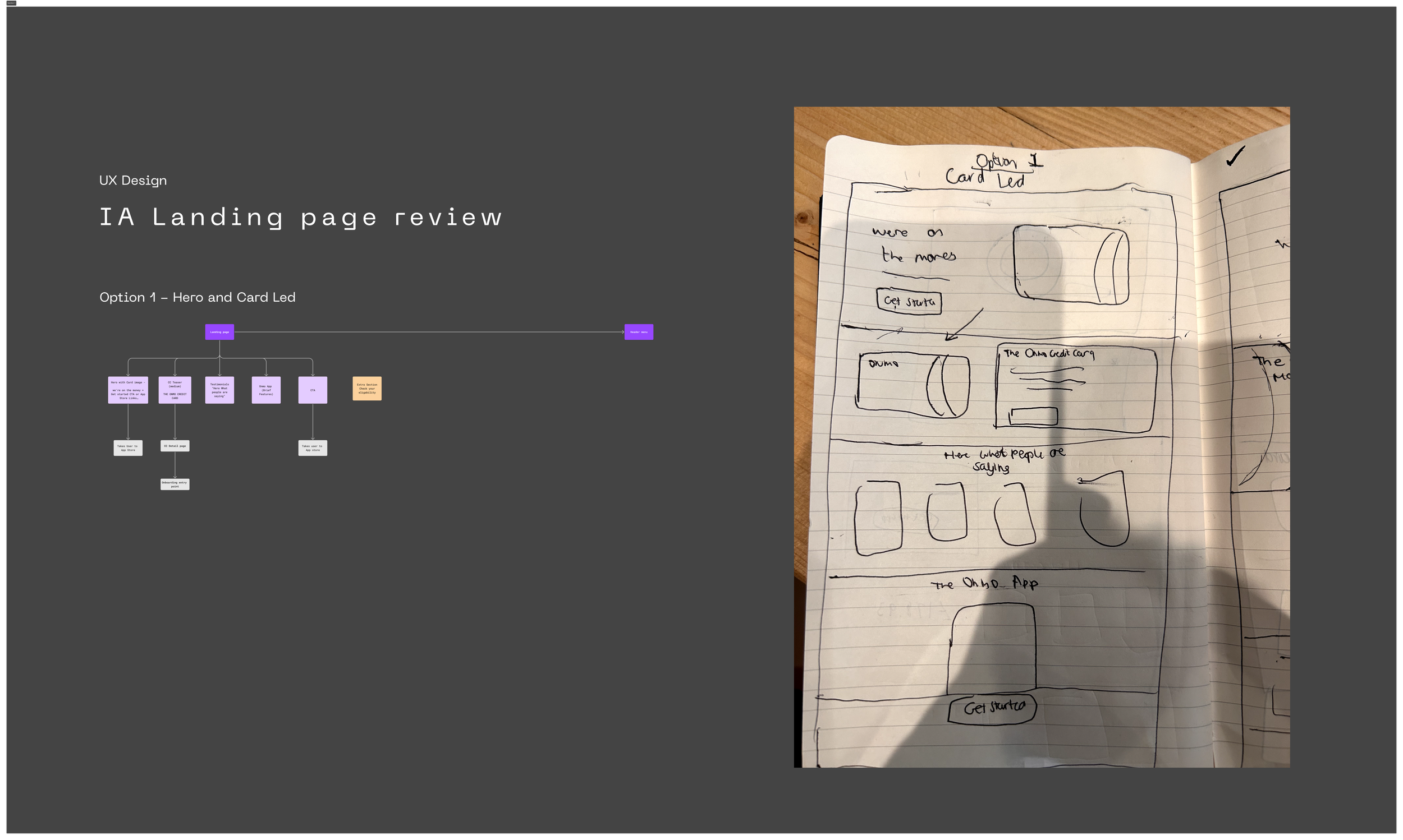
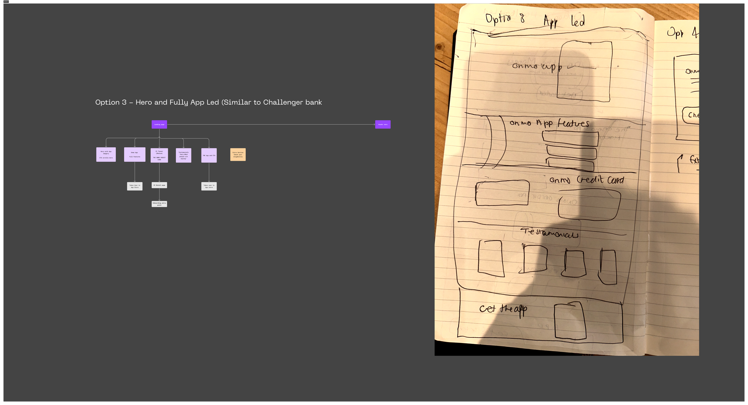
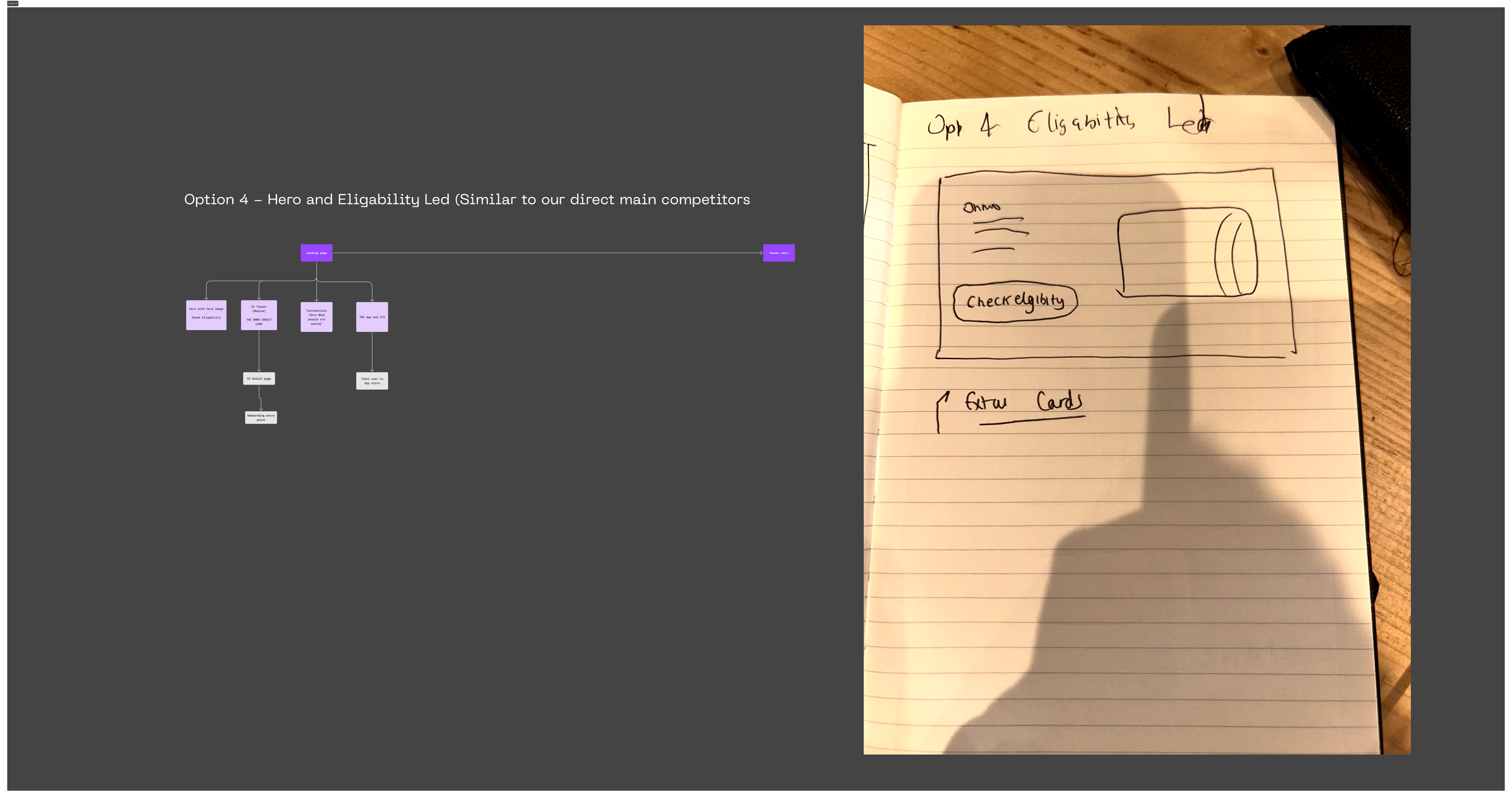
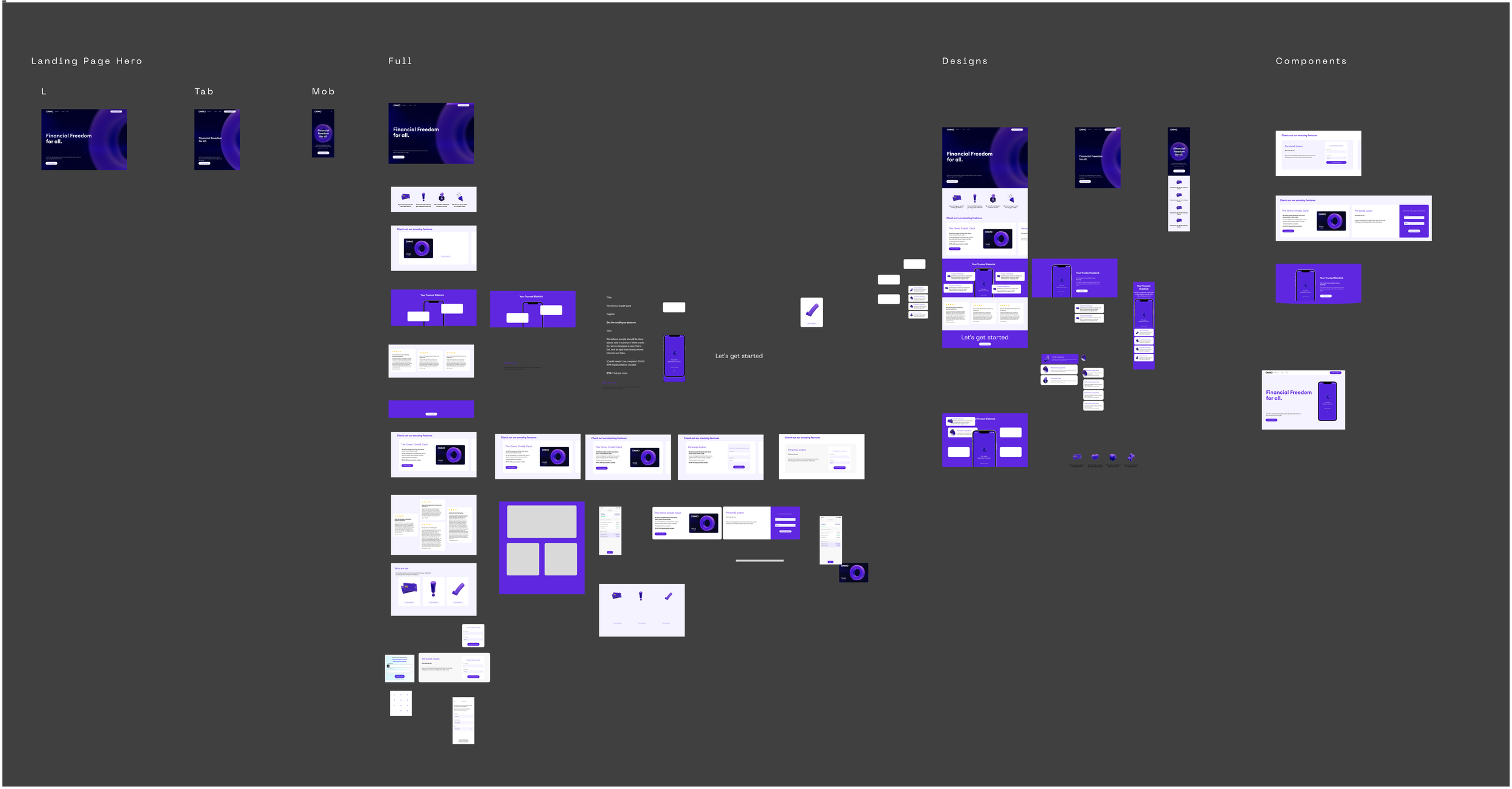
Wireframes & Content
I created an IA overview of the landing page and reviewed it with the Head of Design, presenting four possible options. After narrowing it down to two options, I finalised the content and layout structure.
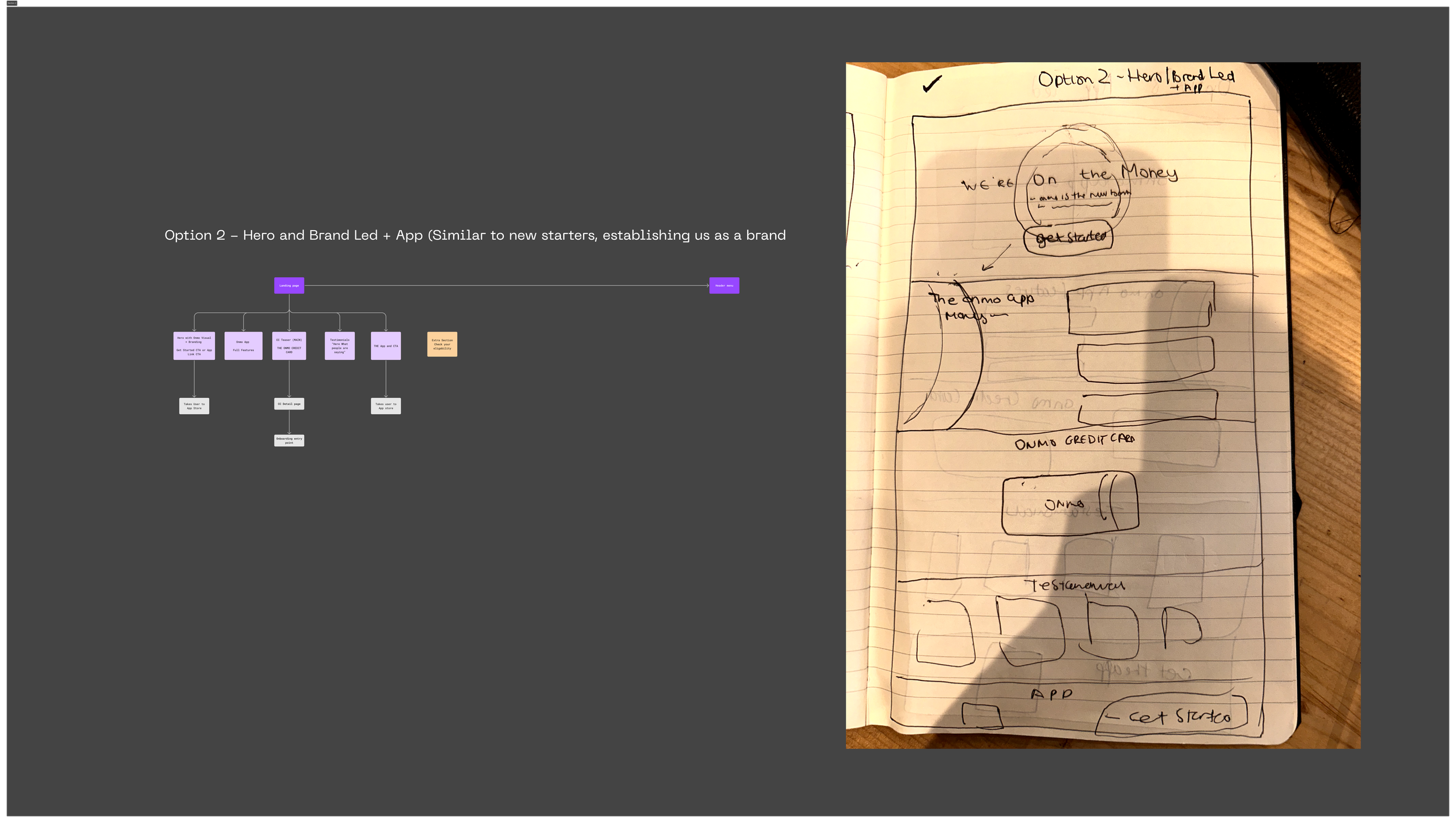
Based on the discussions with the head of design and business, we have decided to adopt a strategy that focuses on two main areas:
Brand Focused: Emphasising the brand identity, values, and unique benefits that Onmo offers. This approach is intended to build brand awareness, create a strong brand presence, and communicate the core message of what Onmo stands for.
New App Focused: Highlighting the features, functionality, and advantages of the new app. This strategy aims to encourage users to explore and download the app by showcasing its innovative aspects and user-friendly design.
By concentrating on these two areas, we can effectively introduce Onmo to the market and attract potential users by clearly communicating both the brand’s value proposition and the app’s capabilities. This dual focus will help in establishing a strong foundation for Onmo as a recognizable and preferred choice among its target audience.
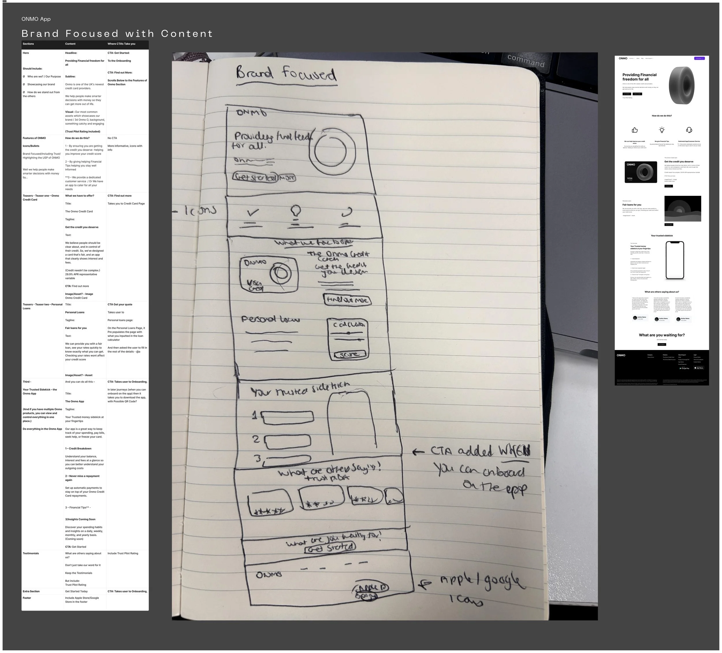
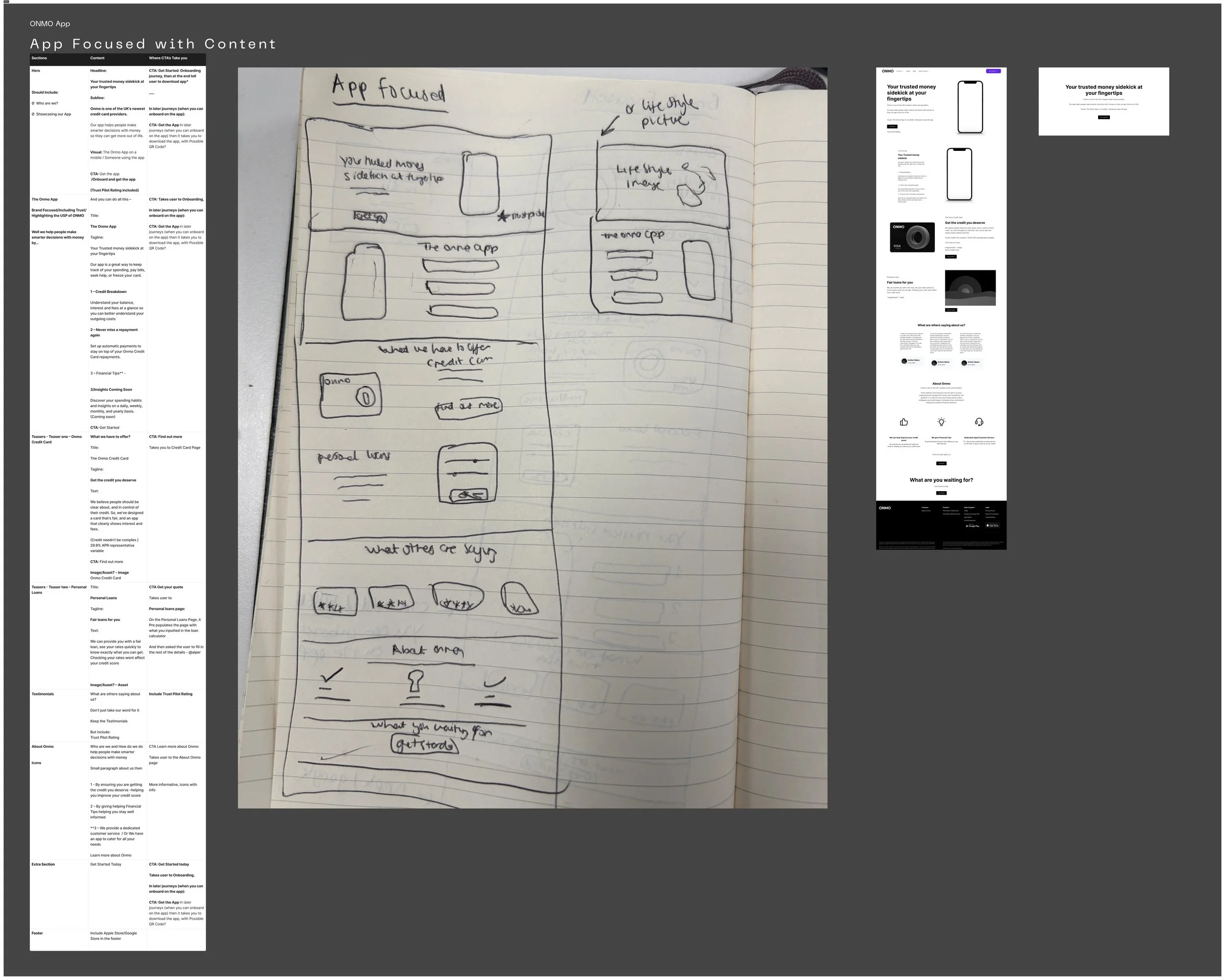
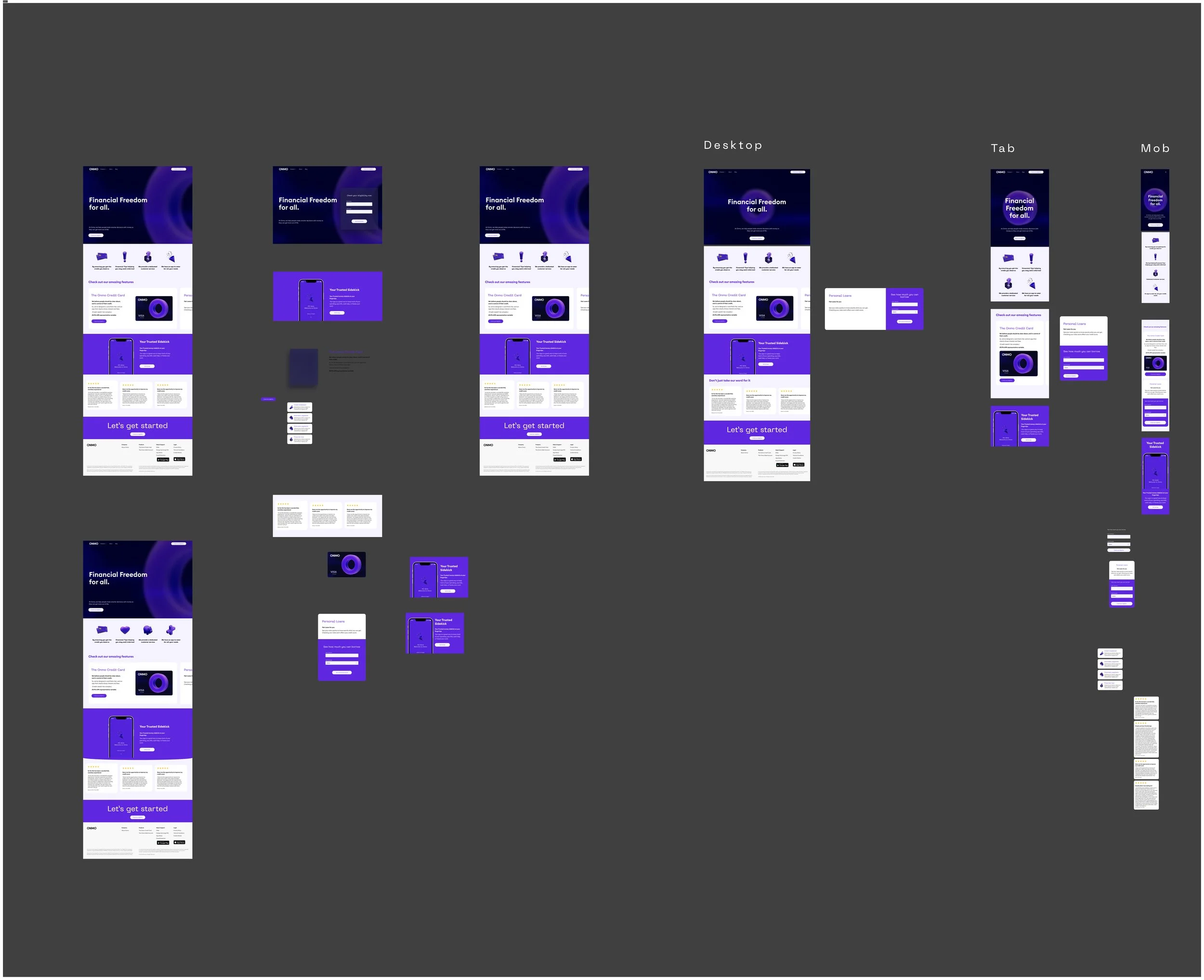
Design & Layout
I developed low-fidelity UI designs, ensuring responsiveness and checking in on the design process. I created visual assets, including images, graphics, and videos, and incorporated motion design to enhance the user experience.
Usability Testing
Usability Testing Summary
During our usability testing, we presented two design options to a small group of users:
Option A: Brand-focused design
Option B: App-focused design
Feedback indicated that the brand-focused design (Option A) was significantly more effective in conveying the intended message. However, users found the "Features of ONMO" section in this design to be cluttered, disrupting the narrative flow of the landing page.
Additionally, users highlighted the need for an eligibility verification step before proceeding further. This was important because it allows users to quickly determine if they qualify for ONMO's services, saving them time and setting clear expectations from the start.
Based on this feedback, we decided to remove the "Features of ONMO" section and incorporate the following improvements to enhance the brand-focused proposition:
Visual Appeal: Enhanced the visual elements to capture users' attention, ensuring the new brand designs clearly and concisely communicate ONMO's identity and values in the hero section.
Eligibility Check: Incorporated a prominent call to action encouraging users to check their eligibility, addressing the user feedback that a level of eligibility verification is still necessary.
Feature Rail: Maintained the feature rail as a secondary element, ensuring it supports the primary focus without cluttering the page.
7. Final UI, Motion & Building for Webhost
The UI is in its final stages of becoming high fidelity. We have been exploring motion design to make the landing page more interactive, enhancing user engagement and experience. Additionally, we are in the stages of selecting web hosting for development and are considering Webflow as a potential solution. Once the site is live, we will monitor and analyse insights to determine if our conversion rates have improved.