Apple Pay Integration - Nomo Mobile App
Improve the users experience of Nomo by allowing them to add their Nomo Bank card to Apple Wallet
My Role: Product Design (UX/UI) | Tools: Figma
Design Process
-
Objectives & Understanding
Understanding the User
Competitor Research -
Userflow & Journeys
UI Prototype
Testing of different scenarios -
High Fidelity UI
Designing of Card Artwork
Handoff
Overview
Problem/Challenge
Apple Pay has been a very popular request for our customers. With the evolution of digital finance, customers now expect to have Apple Pay with their banking apps.
By adding Apple Pay to Nomo we will be helping our customers have an easier, safer, more secure, and private payment method – in shops, on websites or in an app.
Benefits
Customers have a card they can spend in stores the instant they have successfully onboarded
The convenience of paying securely using their phone without needing their wallet
Allows customers to make purchases in-app without needing to remember any of their card details.
Solution
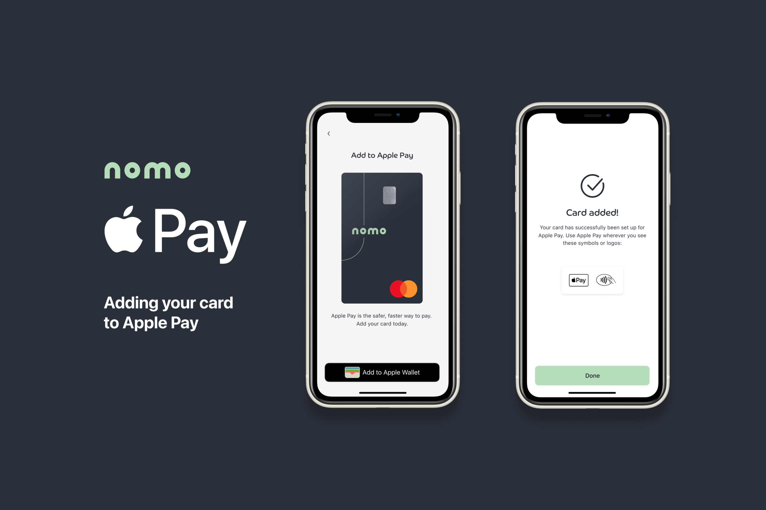
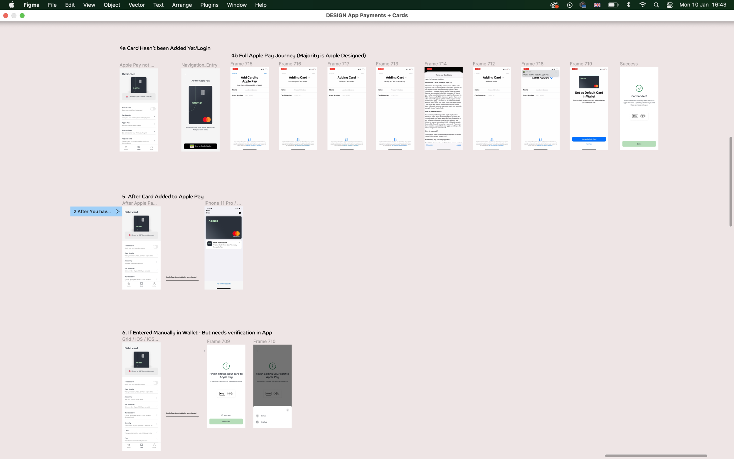
Introducing the option to add Apple Pay after successfully ordering your card
Adding the option to add Apple Pay within the Card tab
The customer can also use this navigation area to go to Apple Wallet and manage their card
We also designed the look and feel of how the Nomo card will look within Apple Wallet for both Nomo and the Exclusive Nomo Card.
Key business achievements:
The introduction of Apple Pay greatly improved user uptake
Expanded payment options, enhancing user convenience and flexibility, leading to increased transactions.
Research & Competitor Analysis

Competitor Research

Userflow and wireframes


Usability Testing
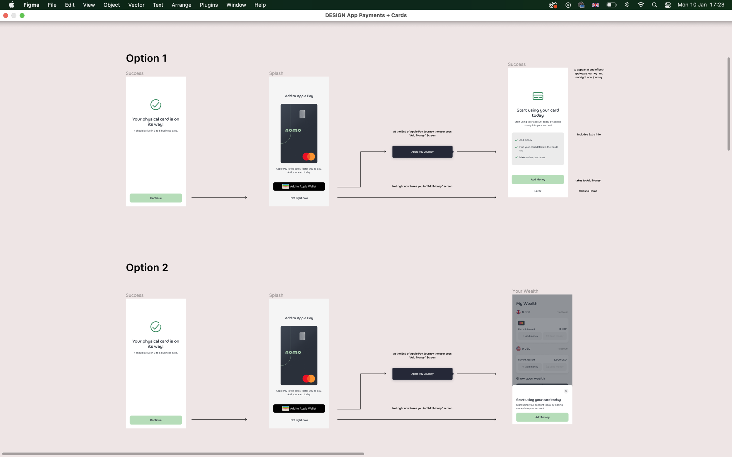
Once we introduce Apple Pay, we want to ensure that users are still told that they can Add money to their account to start spending straight away.
there were two ways we presented this to our testing audience:
Option One - An extra Screen at end of journey - detailed full screen prompting them to add Money, before entering the homepage.
Option Two - They enter the homepage and an overlay appears, prompting them to add money.
Number of people - 11
Location - London
Tasks
Show the users the new Apple Pay journey,
Once they successfully add their Nomo Card to Apple Wallet, we then show them two versions to get them to add money to their account:

Outcomes
A very close results showing 5/11 users preferring option 2 and 6/11 users preferring option 2.
Some of the main reasons for option two was to do with being able to have a view of the actual homepage interface and getting a feel for the app before adding Money. Some of the people that preferred option two also didn’t mind which one
We asked the users if they would like the overlay option to appear (to remind them to add money) the next time they logged into their account.
6/11 of the users said Yes they would like to see this option, and from this we also discovered that they would only want to see it a few times and not every time they logged in, as they felt that this would be overkill
Conclusion + Proposal
As the results were so close, the suggestion would be to include both options but in a slightly different way:
When a user is first signing up, to show them the Overlay option, but includes the information that was in the full screen option. This option is still welcoming the user, and the user is still able to see part of the Home Screen. The main option here is to add Money, which we would like them to do.
If a user chooses not to add money at this stage, then the next time they log in, we could then show them the overlay screen (only once), with less information this time.
UI Prototype


