ONMO — MOBILE APP, WEB & INTERNAL SYSTEMS
My Role: Senior Product Designer (UX/UI) | Mobile App · Web · Internal Tools | Figma · Webflow · Research & Interviews

Overview
Onmo is a UK-based credit card provider.
During my time there, I worked across customer-facing and internal products, helping shape how users understand their money, how the app feels in day-to-day use, and how internal teams manage operational work.
Rather than a single end-to-end project, my impact at Onmo came from multiple focused initiatives, each solving a specific problem but contributing to a more consistent, usable product overall.
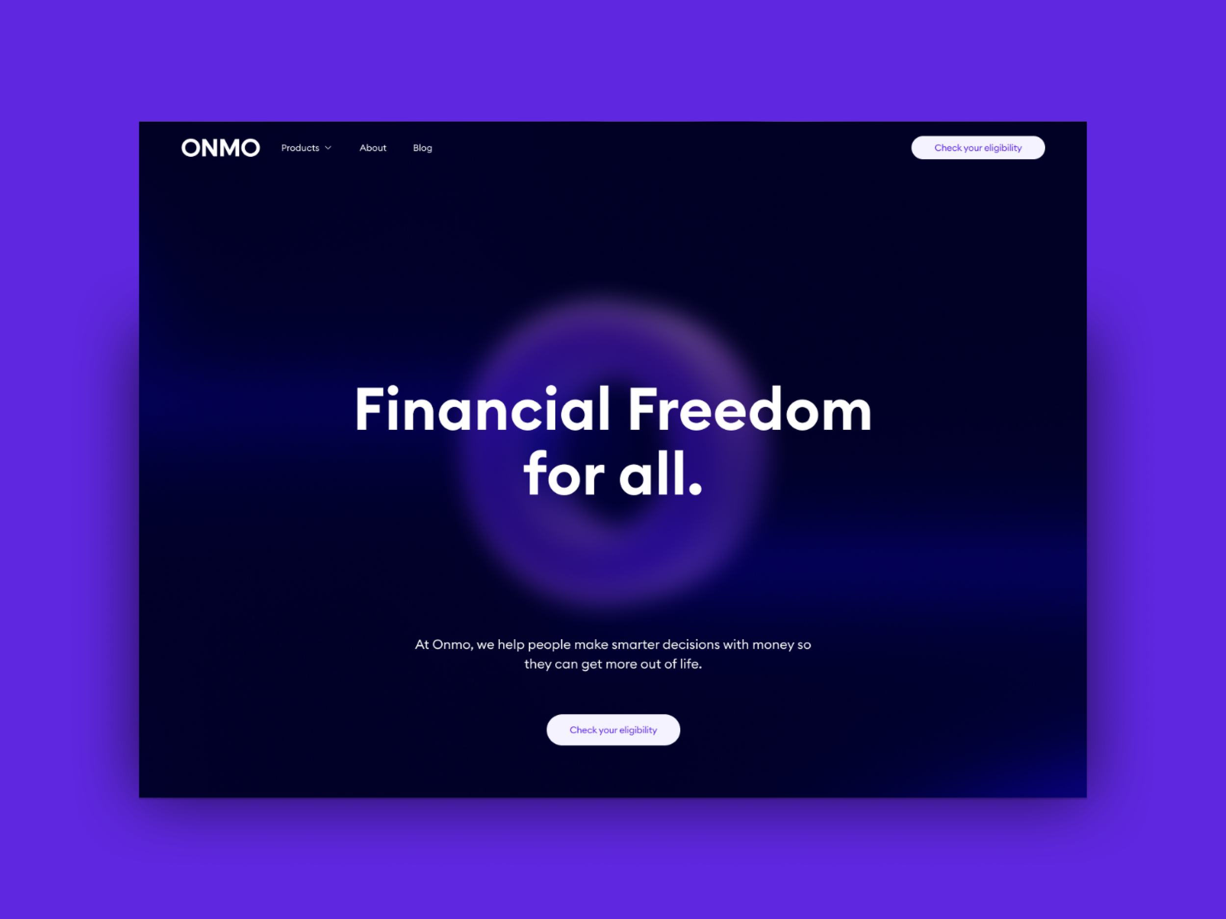
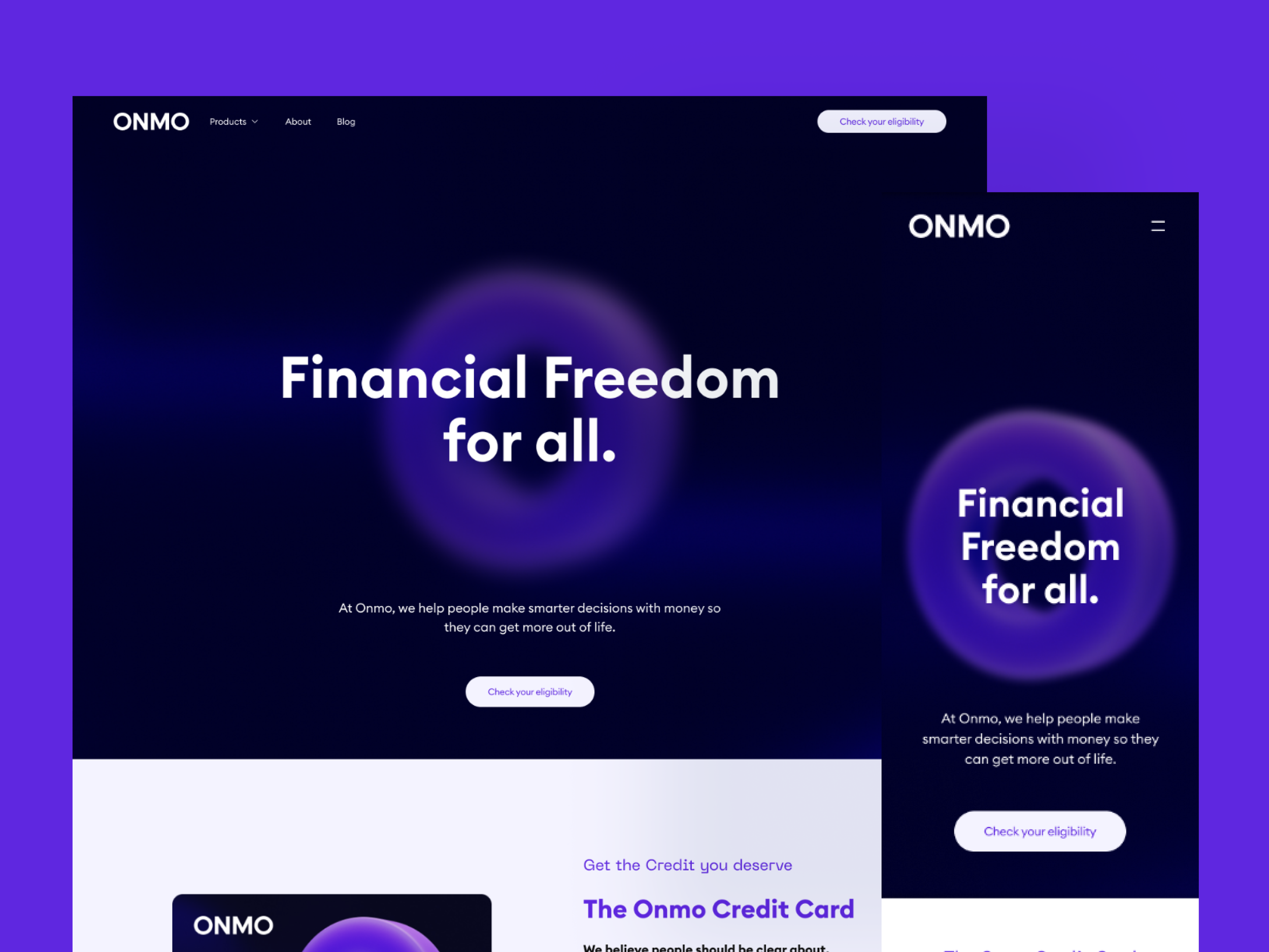
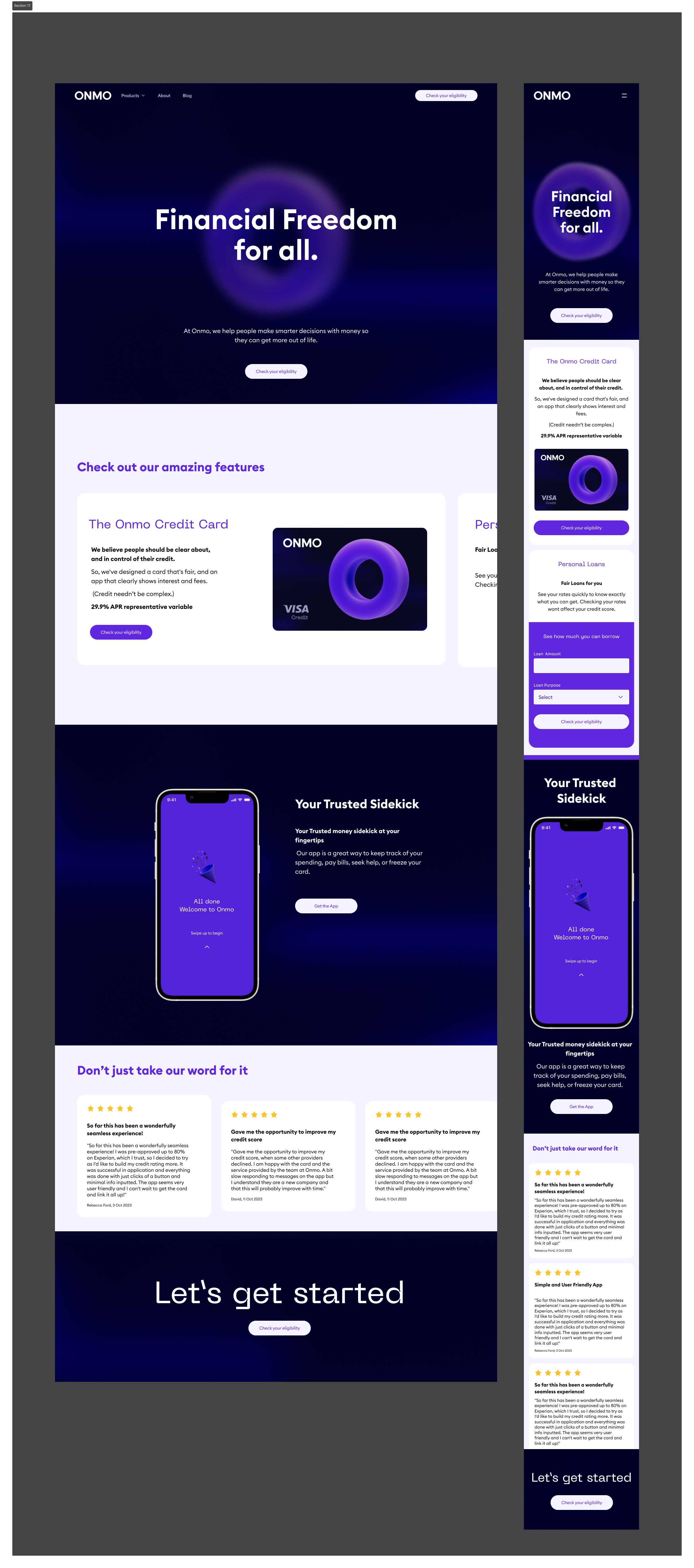
Landing Page Redesign (Web)
The challenge
The existing landing page lacked clarity around Onmo’s core proposition, making it difficult for users to quickly understand the product and its benefits.
My role & approach
Reviewed analytics and user behaviour to understand drop-off points
Audited competitor credit card and fintech landing pages
Simplified the information architecture and content hierarchy
Worked closely with stakeholders to align messaging and business goals
Outcome
Clearer proposition and product messaging
Improved scannability and visual hierarchy
A more confident, trustworthy first impression for new users
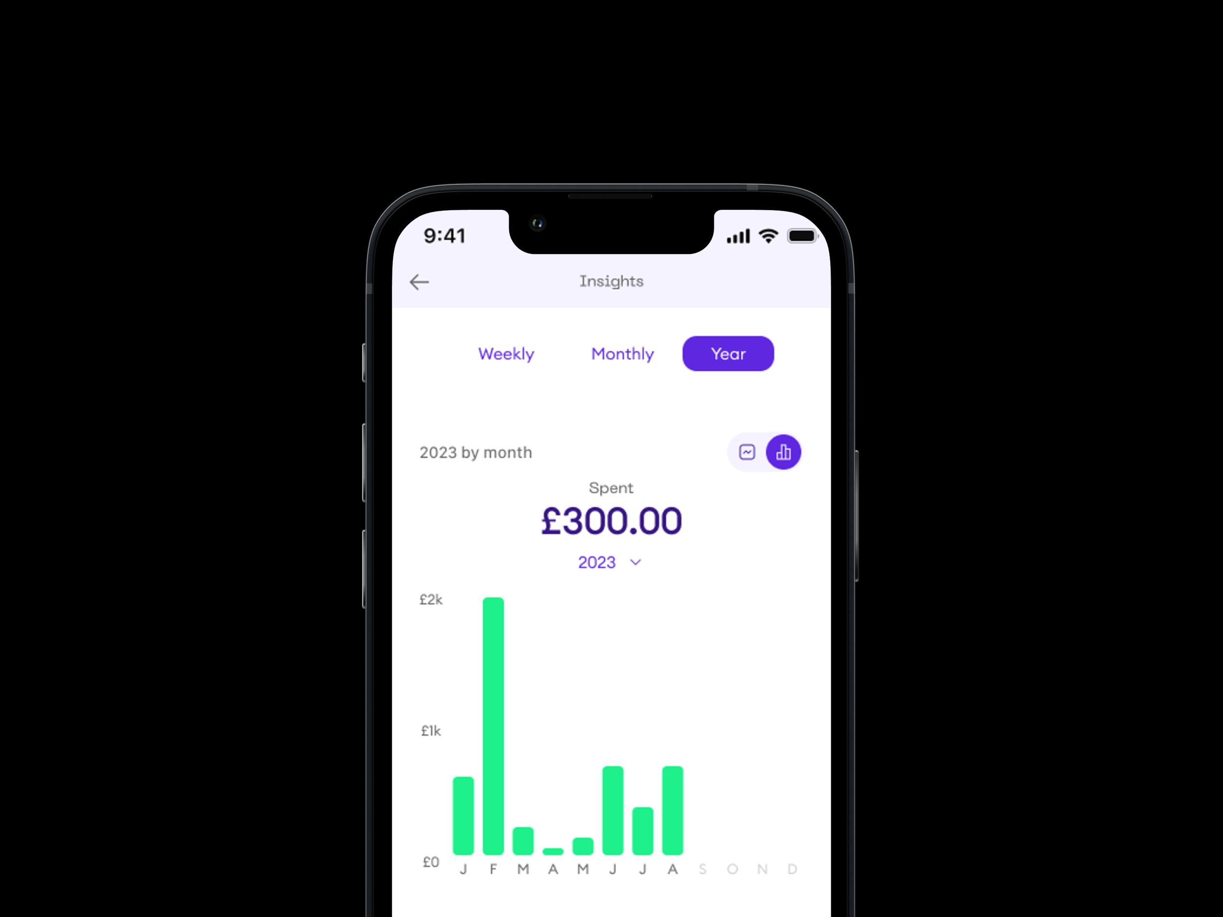
Insights (Mobile App)
Improving how users understand their spending
Problem
The initial Insights concept tested well, but it needed to:
Better align with Onmo’s new branding
Provide more actionable, meaningful insights
Scale beyond monthly views into weekly and yearly understanding
What I Did
Led competitor benchmarking (Revolut, Monzo, Chase) to identify common patterns and gaps
Analysed user testing feedback to understand how people actually used insights
Explored multiple UI directions for categories, charts, and layouts
Defined category structures using data input from analytics
Iterated designs based on feedback sessions with product and stakeholders
Key Design Decisions
Prioritised category-level breakdowns to help users quickly spot spending patterns
Used visual weight (size, hierarchy) instead of pure numbers to improve scanability
Designed the system to support weekly, monthly, and yearly views
Created space for future financial recommendations, without over-engineering the MVP
Impact
Clearer spending visibility for users
A scalable Insights foundation ready for future releases
Designs prepared for developer handover in the new app rollout
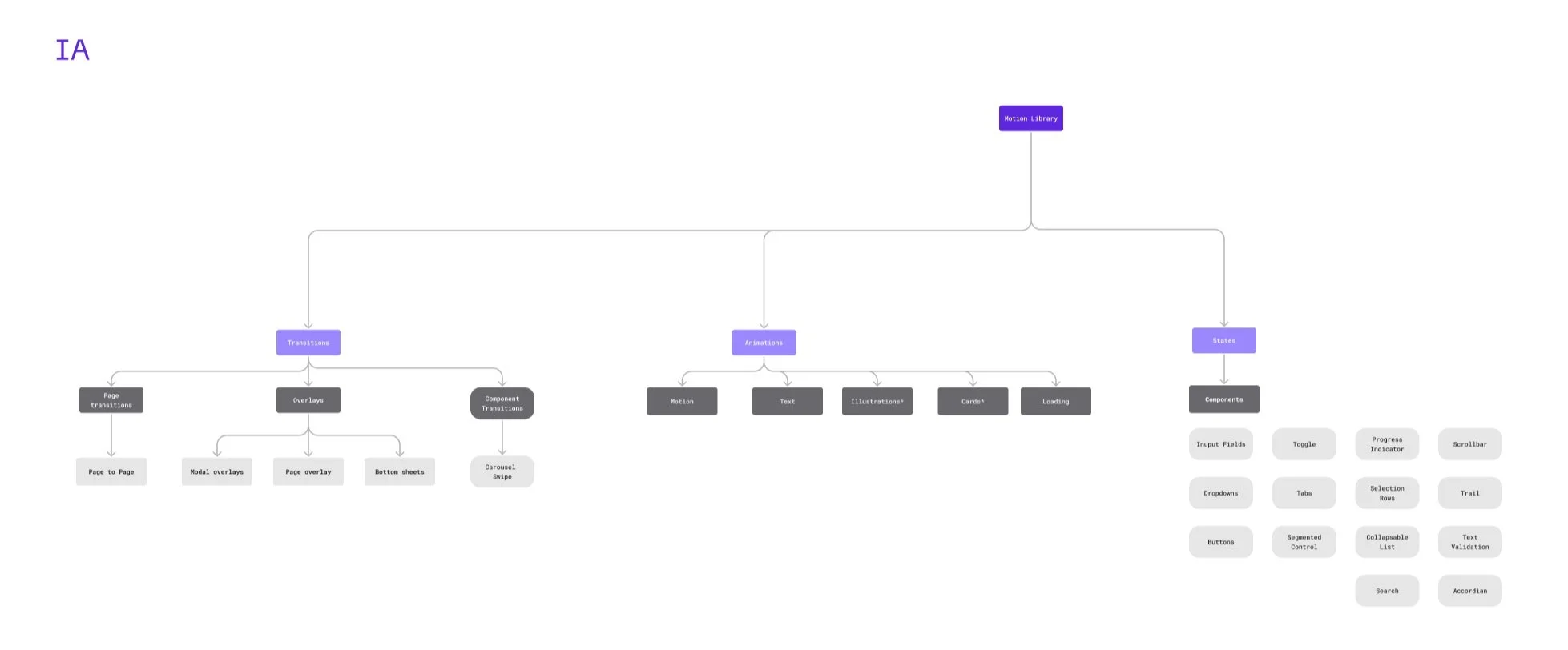
Motion Library (Mobile App)
Creating consistency and clarity through motion
Problem
Motion across the app was inconsistent. Similar interactions behaved differently, which:
Reduced clarity for users
Made it harder for designers and engineers to stay aligned
What I Did
Audited all existing prototypes to identify inconsistencies
Standardised motion for common gestures and transitions
Introduced new motion rules where gaps existed
Documented everything in a Motion Library within Figma
Key Design Decisions
Treated motion as part of the design system, not decoration
Focused on clarity, feedback, and continuity rather than flashy animation
Structured documentation so it was usable by both designers and developers
Impact
Improved consistency across the app
Faster design and development alignment
A reusable motion reference for onboarding new team members
Internal Operations Tool (OHNO)
Designing for internal efficiency
Problem
The Operations team managed work across multiple tools, leading to fragmented workflows and inefficiencies.
What I Did
Took part in early discovery and stakeholder alignment
Led user interviews with the Case Management team
Helped narrow scope to a realistic MVP focused on case management
Designed user flows to support faster, clearer task handling
Key Decisions
Advocated for focusing on one high-impact area rather than a broad, unfocused system
Designed for real operational constraints, not idealised flows
Outcome
Although full development paused due to constraints,
the insights and flows informed how the team improved their existing processesDemonstrated impact even without full product delivery